|
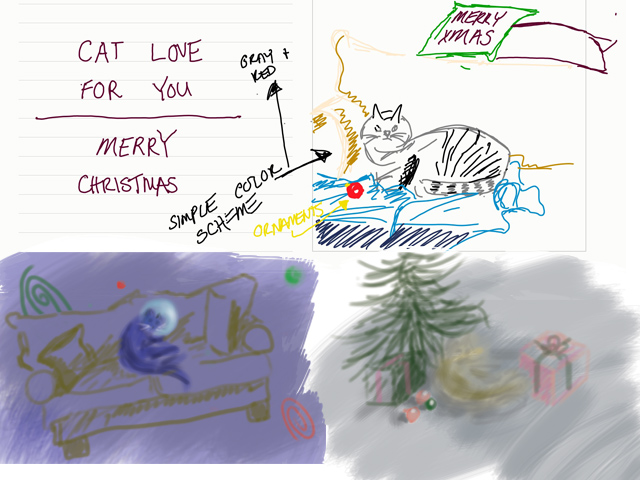
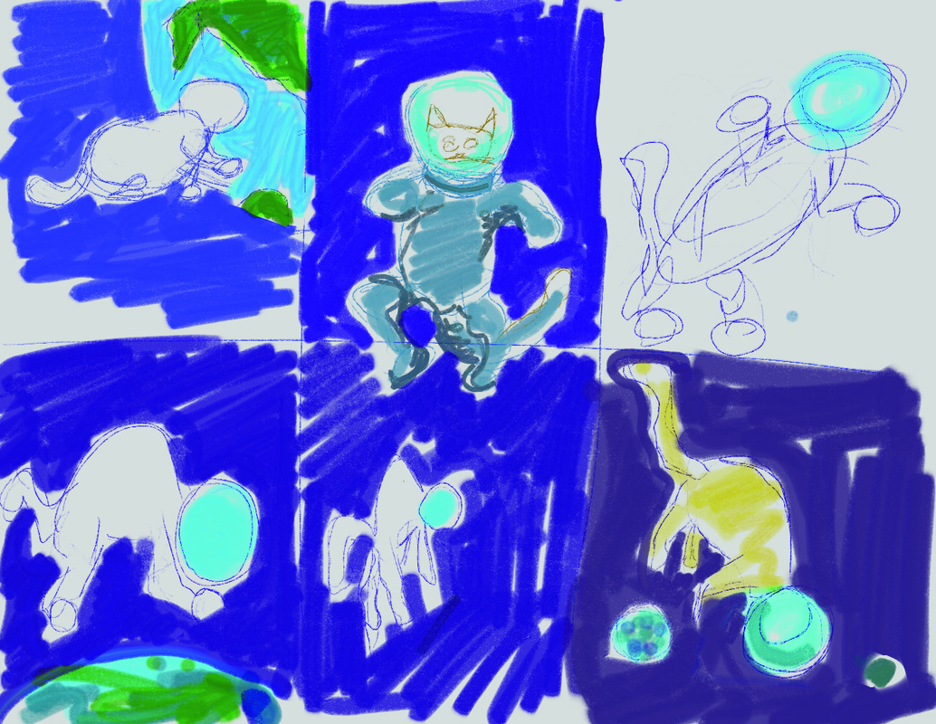
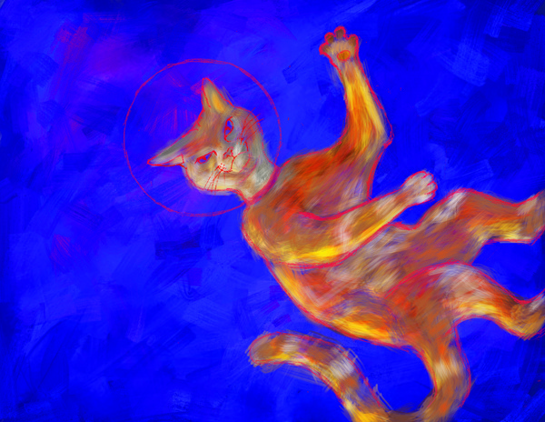
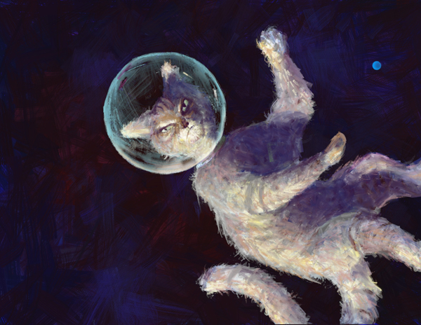
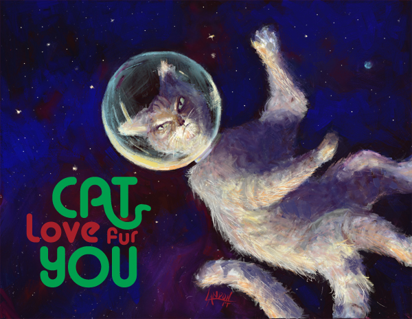
On top is the original idea I had. I was cat-sitting for my girlfriend's parents and I was inspired to draw "Mittens" from life. I grew quite fond of her the three weeks she was with us and I'm not ashamed to say it anymore! The bottom right was another quick sketch done in Photoshop. I quickly realized I wanted to do away with the more common Christmas themes; in the bottom left I cemented the space idea. The thumbnail contained a couch which I was told by Julia that it made no sense in space so I got rid of it,too. One of my mantra's is, "If it's too simple, simplify it more!" But sometimes it takes someone else to remind me of that! (I still think a cat on a couch floating in space is a funny image.) Once I cemented the cat lost in space idea, I googled "cat in space" to see what else was out there. Well, believe it or not, there's apparently hundreds of thousands of cats flying out in space at this very moment... Most of them are really bad Photoshops though. I wanted to have a very lonely cat and considered having Earth in the background to portray this. I also wanted to portray the fact that the cat was lit by the sun it was inching ever so closely towards. I decided to eliminate a [large] Earth in another effort to simplify. I tried doing most of this painting in Photoshop originally. Printing the other two cards made me realize I should try and keep the colors in the CMYK range rather than web colors RGB. You can't do that in ArtRage. (For those who don't know, when printing artwork, etc.. the printer usually only has 4 colors to choose from. When you buy a cartridge from Staples for your computer you are buying the colors Cyan, Magenta, Yellow, and Black. There is a limited set of colors that you can mix from this, I find that blues are especially difficult to match. RGB contains basically all the colors we can see. As an artist and illustrator, there is always a battle to reproduce artwork on paper as it is on canvas, or monitor, or whatever.) Anyways, I still find Photoshop confusing and un-intuitive so I decided to do it over in ArtRage for a more controlled but painterly feel. I liked the warmth of the orange cat in the image before this one but thought it stood out too much. This is space and there is not a lot of light out there, which means there is not a lot of color, too. I liked how the ArtRage program gave me the control to produce a kind of ratty looking cat. You can see I still had a small earth in the right corner. I printed this and saw that it was too dark, of course. I added some brighter blue to the background and some bright stars to really get the spacescape going. I did the type in Adobe Illustrator and spent a good amount of time playing around with the way the "A" in cat mimicked a cat's tail. There was a point where it looked more like a snake than a cat's tail! Originally, it was planned to be Cat love FOR you" but at the very last minute the "fur" pun came to me. I definitely feel that this is a successful image and I am completely happy with it! (I can't say that about a lot of things I've done)
|
Landon R. WilsonWelcome to my blog. Archives
September 2019
|

 RSS Feed
