|
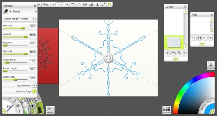
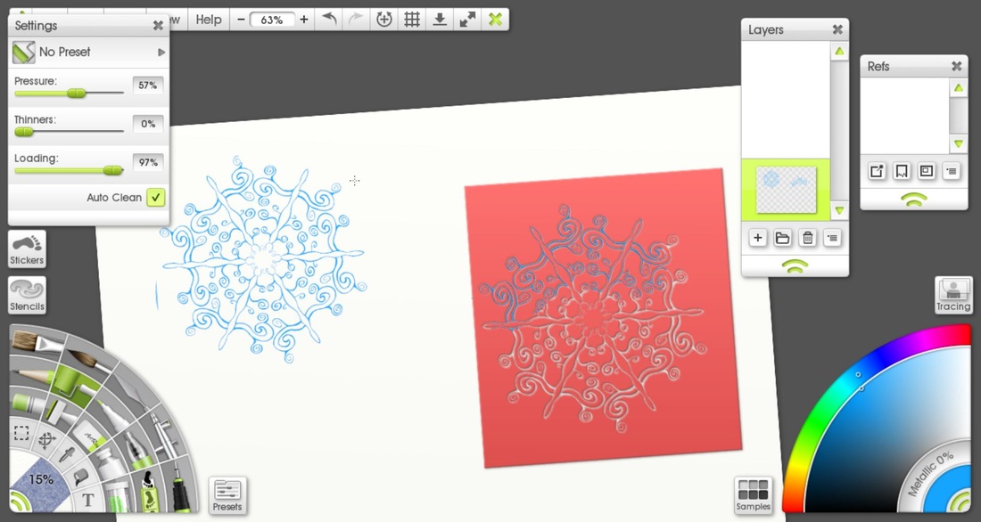
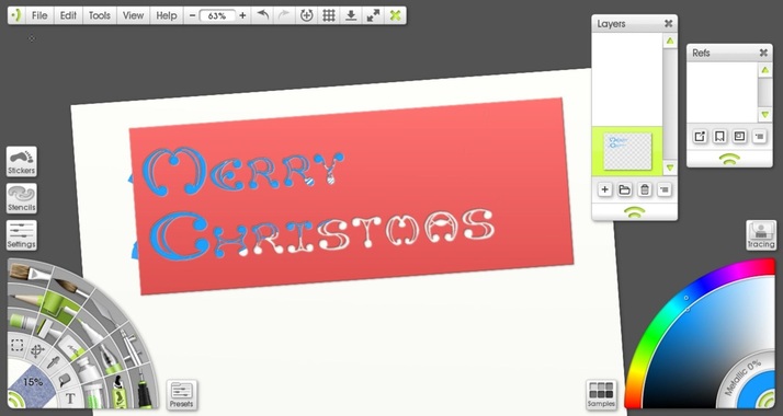
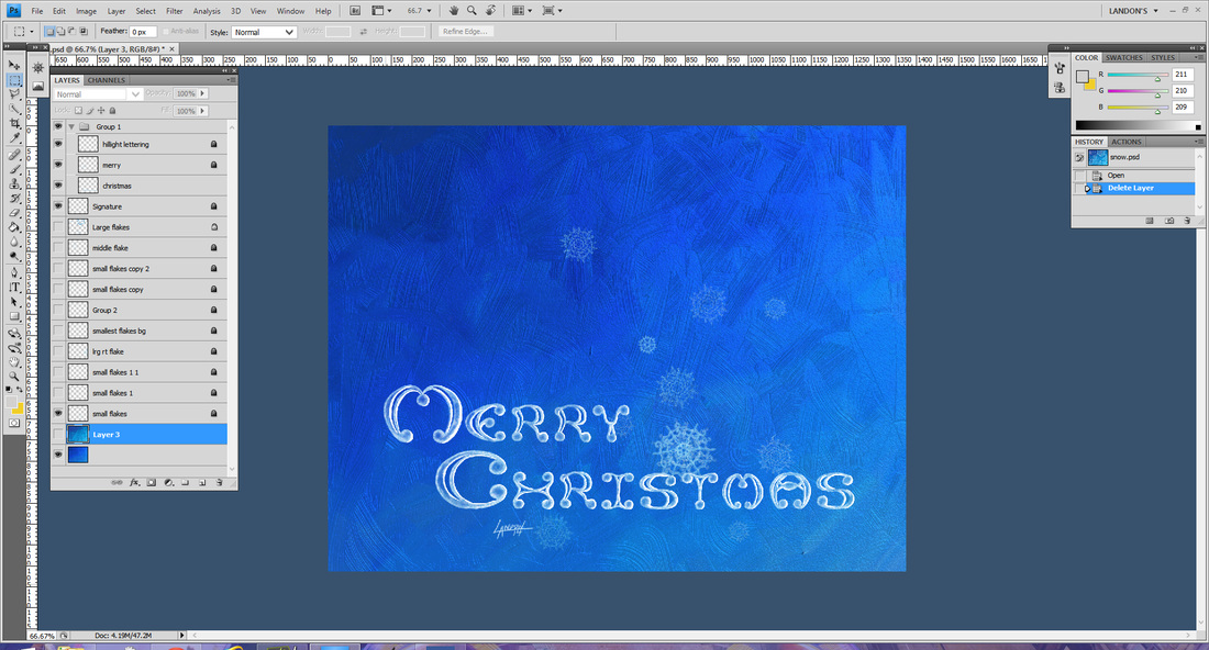
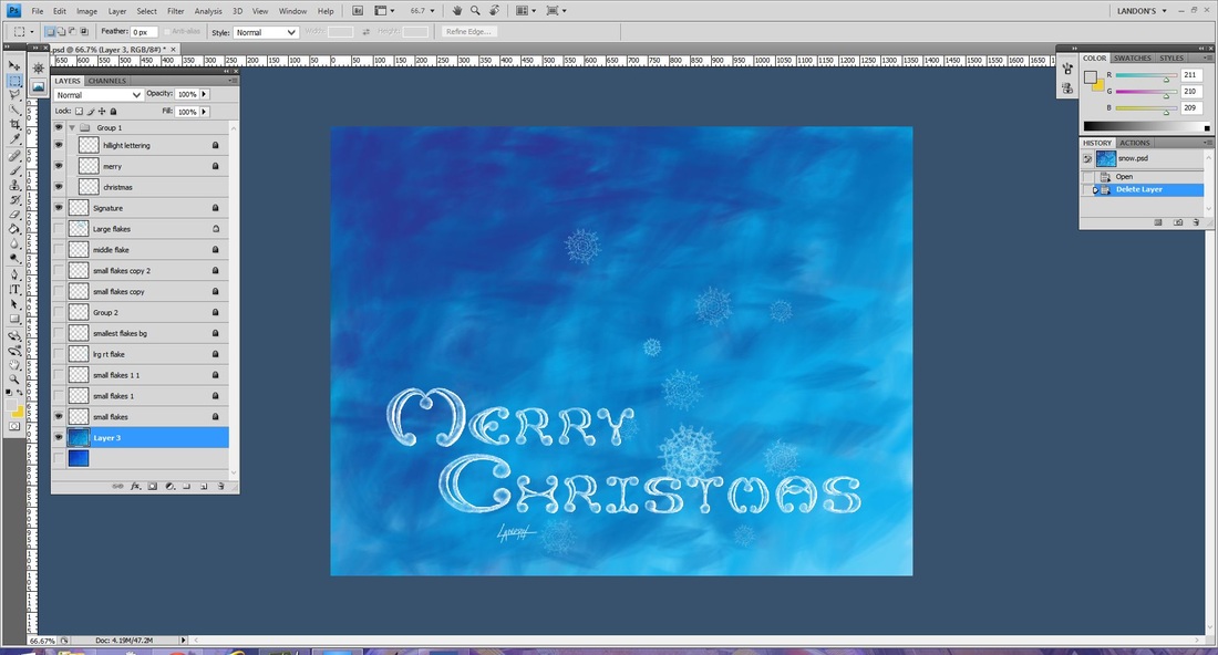
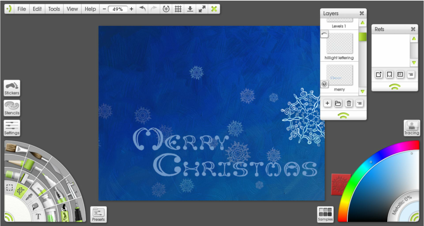
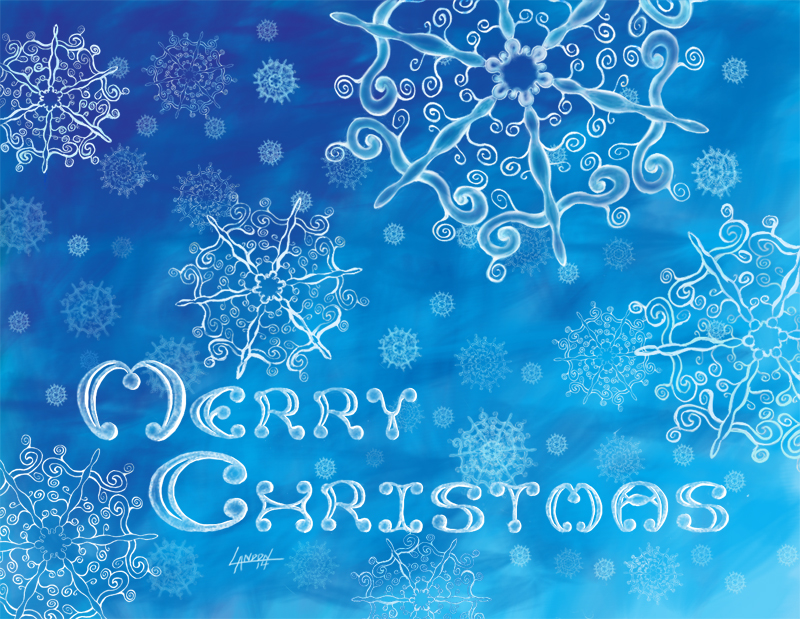
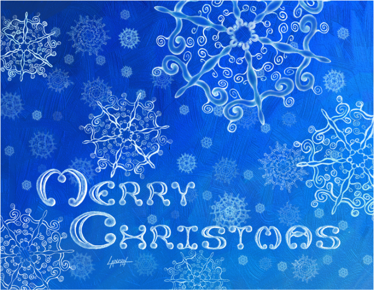
It's Christmas time again. A most wonderful time of the year. Cherished memories come flooding back to me as I'm bombarded by red bow after red bow. Gilded pine combs are in abundance; it's amazing what a bit of shiny paint will do to a decomposing piece of wood. It all makes me warm and fuzzy inside with hopes and dreams of creating new memories. It's mostly the niece and nephew that bring me happiness on Christmas morning now. Despite the rapid-fire opening of presents and nonchalant thanks that leave a lot to be desired, I still enjoy the quality family time. It reminds me of playing the lottery, really. Every year there's that one gift that makes their eyes gloss over and captivates their attention for the rest of the day. The only question remains... will it be mine this year? One can only hope. Well here is my last design for Christmas cards this year. I look forward to continuing this tradition and am excited for what I will do next year! I started off with the Paint Symmetry tool in ArtRage 4 (for the Desktop). I researched the fact that snow flakes are six-limbed. I changed how many axis' their are in the Paint Symmetry tool so that it mirrored my brush strokes six times over. Once I was satisfied with my design I made a Stencil with it. This allowed me to replicate the basic pattern over and over again easily and also scale it to any size I wanted. The lettering I did from scratch. It took a long time, like a really long time.. so long I don't want to admit it publicly. Unfortunately I don't have any process shots of that but basically I started drawing in pencil on one layer. I had to lay out two rulers and space each letter individually. Then on a layer on top I inked my design while continually tweaking the letters. Once I was happy with that I made a stencil so that I could move the type around anywhere I wanted to. Originally I planned to do this all in ArtRage, and I used the Oil Tube brush and splattered on thick gobs of paint and then pushed it around with a large Oil brush to create that nice gradient from dark to light. You can really see the texture of the brush strokes here. When I printed a test out it was barely noticeable that I had a gradient. You also couldn't see the texture in the brushstrokes. I decided to re-do the gradient in Photoshop. You can see the difference easily, there is no more natural looking texture and it is a different blue (It is Cyan so that the printer can replicate it properly.) I printed this and it looked pretty good. From there I just kept adding more snowflakes by copying and pasting, varying their sizes, opacity, and location until I was satisfied with the composition. For the snowflakes in the foreground I painted on top of the original stencil to change them so that there were little differences in each of them. Below is the final PRINT version. Compare the difference to the final Digital version which is below that. I may take next week off so Happy Holidays to you and your family :) May you feel loved and blessed as I do.
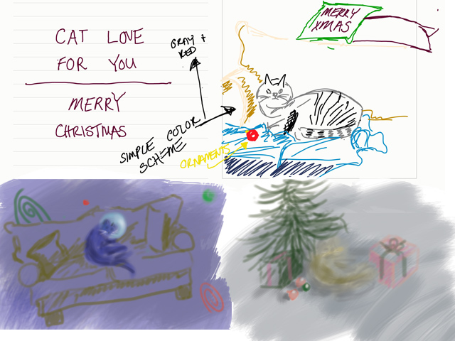
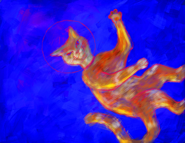
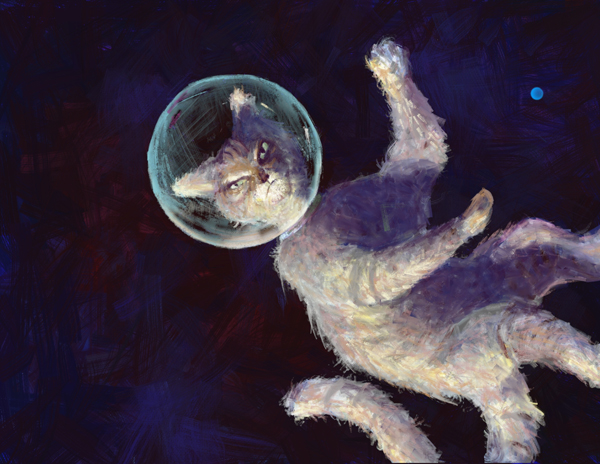
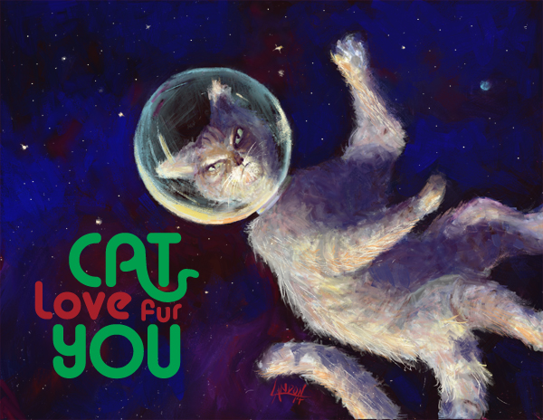
On top is the original idea I had. I was cat-sitting for my girlfriend's parents and I was inspired to draw "Mittens" from life. I grew quite fond of her the three weeks she was with us and I'm not ashamed to say it anymore! The bottom right was another quick sketch done in Photoshop. I quickly realized I wanted to do away with the more common Christmas themes; in the bottom left I cemented the space idea. The thumbnail contained a couch which I was told by Julia that it made no sense in space so I got rid of it,too. One of my mantra's is, "If it's too simple, simplify it more!" But sometimes it takes someone else to remind me of that! (I still think a cat on a couch floating in space is a funny image.) Once I cemented the cat lost in space idea, I googled "cat in space" to see what else was out there. Well, believe it or not, there's apparently hundreds of thousands of cats flying out in space at this very moment... Most of them are really bad Photoshops though. I wanted to have a very lonely cat and considered having Earth in the background to portray this. I also wanted to portray the fact that the cat was lit by the sun it was inching ever so closely towards. I decided to eliminate a [large] Earth in another effort to simplify. I tried doing most of this painting in Photoshop originally. Printing the other two cards made me realize I should try and keep the colors in the CMYK range rather than web colors RGB. You can't do that in ArtRage. (For those who don't know, when printing artwork, etc.. the printer usually only has 4 colors to choose from. When you buy a cartridge from Staples for your computer you are buying the colors Cyan, Magenta, Yellow, and Black. There is a limited set of colors that you can mix from this, I find that blues are especially difficult to match. RGB contains basically all the colors we can see. As an artist and illustrator, there is always a battle to reproduce artwork on paper as it is on canvas, or monitor, or whatever.) Anyways, I still find Photoshop confusing and un-intuitive so I decided to do it over in ArtRage for a more controlled but painterly feel. I liked the warmth of the orange cat in the image before this one but thought it stood out too much. This is space and there is not a lot of light out there, which means there is not a lot of color, too. I liked how the ArtRage program gave me the control to produce a kind of ratty looking cat. You can see I still had a small earth in the right corner. I printed this and saw that it was too dark, of course. I added some brighter blue to the background and some bright stars to really get the spacescape going. I did the type in Adobe Illustrator and spent a good amount of time playing around with the way the "A" in cat mimicked a cat's tail. There was a point where it looked more like a snake than a cat's tail! Originally, it was planned to be Cat love FOR you" but at the very last minute the "fur" pun came to me. I definitely feel that this is a successful image and I am completely happy with it! (I can't say that about a lot of things I've done)
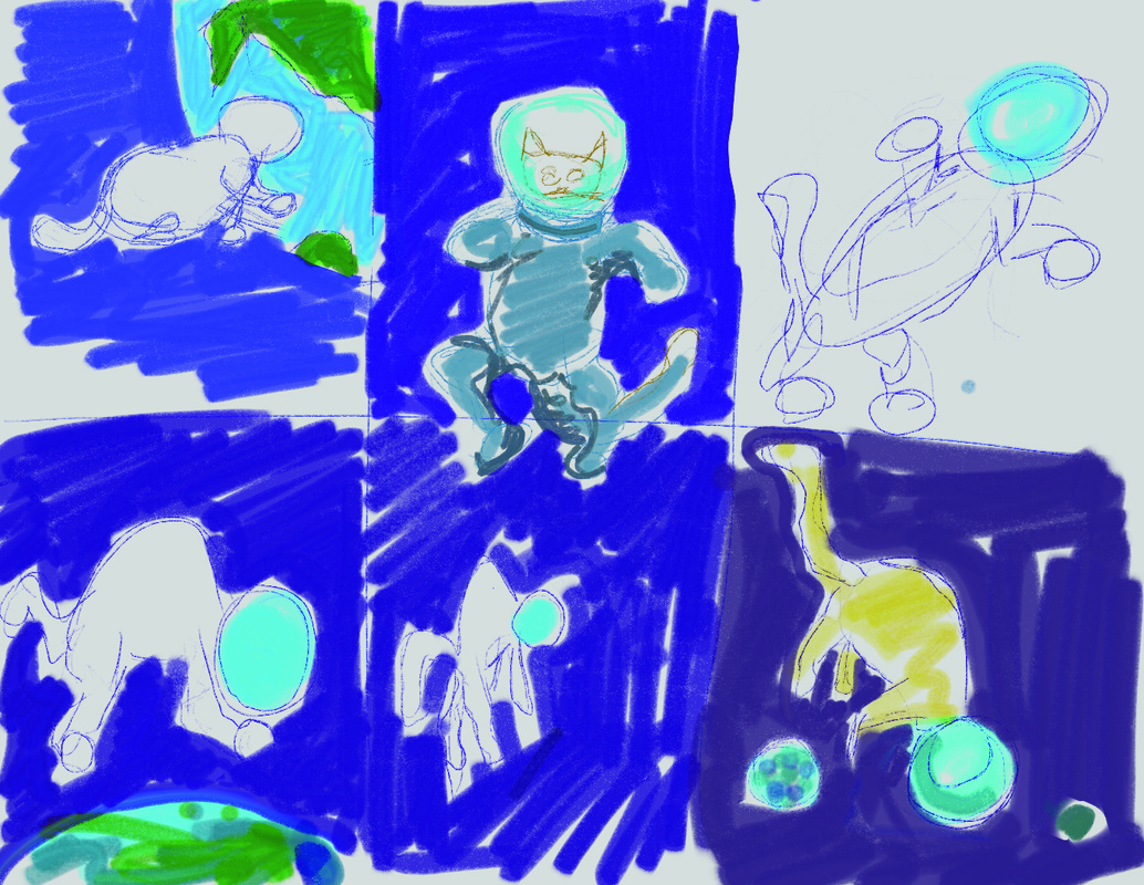
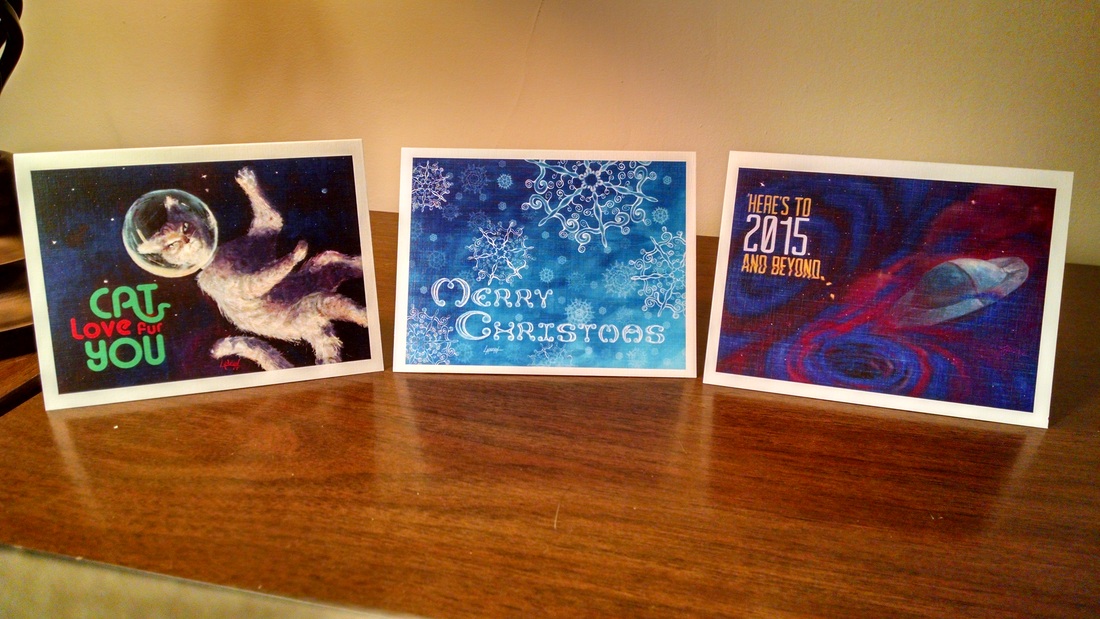
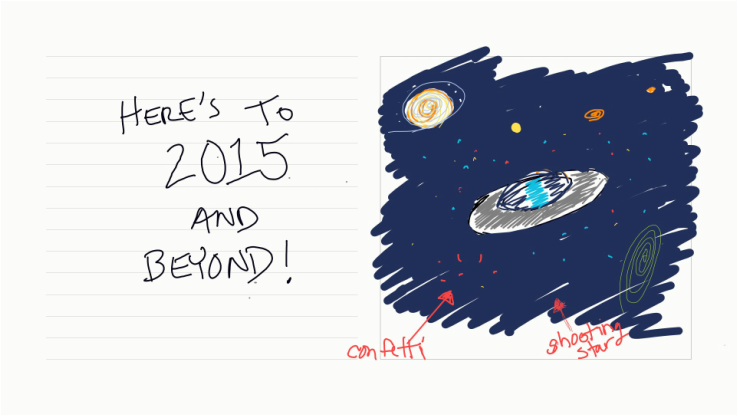
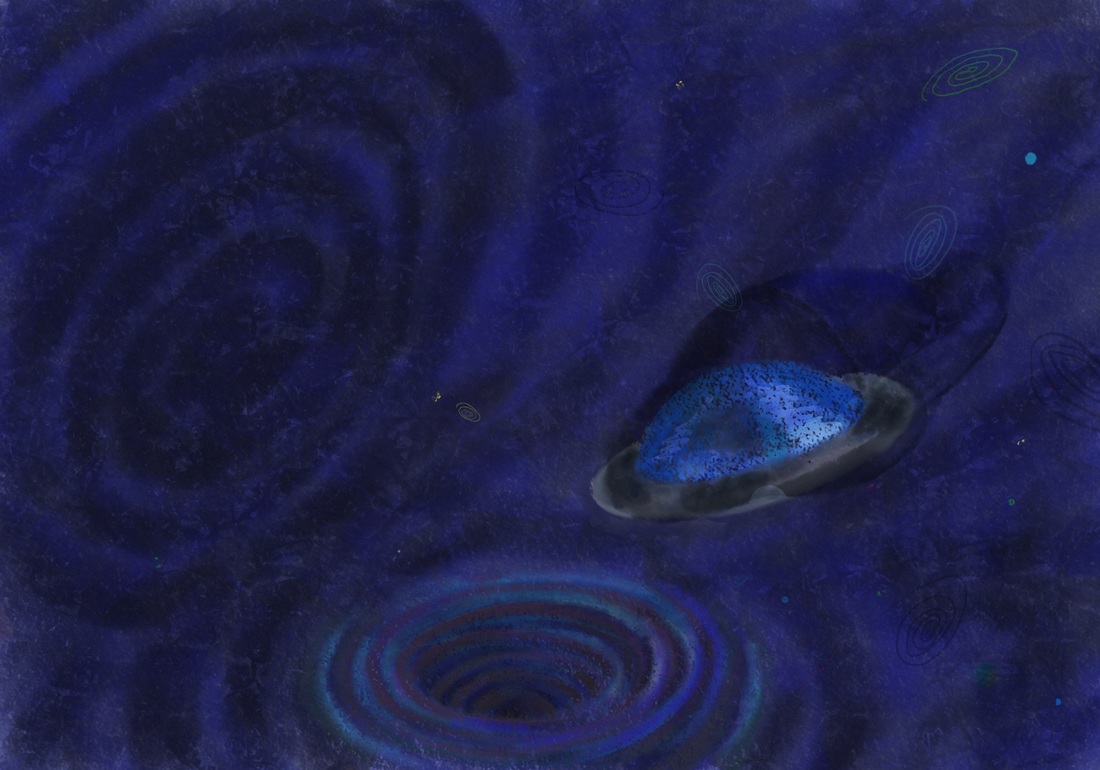
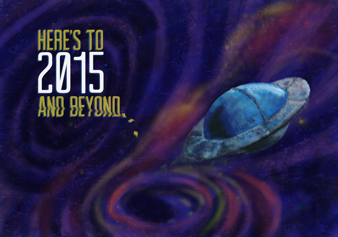
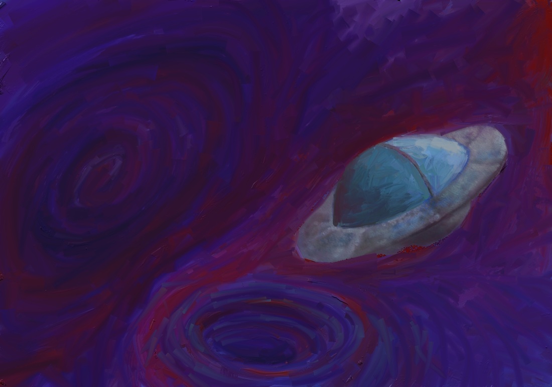
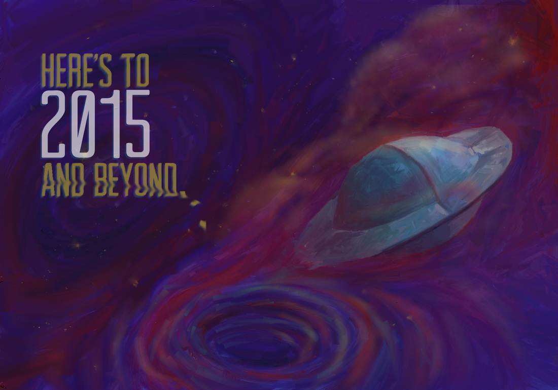
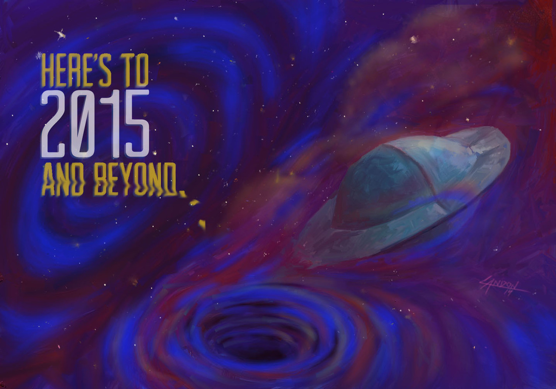
I finally finished my first series of illustrated holiday cards. Each image was digitally painted by yours truly. Some of the typography was also made from scratch by me (the Merry Christmas lettering was done by hand). The cards were printed on linen card stock with a color front and black and white back. The inside is free for you to inscribe whatever your heart's desire. Each week I will go through a card step-by-step so you can see how it was made. If you are interested on purchasing the cards I will ship them to you. I will provide a direct link to my online store at the end of the post. In this first image, I was simply fleshing out multiple ideas. I enjoy making the loose swirly ellipses you see in different colors. They make appearances in many of my sketches and final artworks. I briefly thought of making the stars confetti, but decided that would be too much. 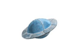 Instead of using the Chalk brush, I decided to use the Oil brush. I love oil painting and the ability to mix colors on the canvas; ArtRage does a great job of replicating that feeling. I turned the swirly ellipse into a blackhole-like whirlpool at the bottom of the composition. I mimicked the whirlpool idea above and to the left, too. I just saw Interstellar in the IMAX theater. It was awesome. An experience rather than just a movie. There is something about the mystery surrounding black holes that really intrigues me, and everyone else I'm sure. Imagine if we knew everything about everything. What a crappy life that would be! I think the visual depiction of the black holes in Interstellar were truly awe-inspiring and deeply inventive. Onward and upward.. you can see that I am still testing out textures in the ArtRage program I am using. This was the first design I did and I had a lot to learn about my favorite new painting software program. The spaceship especially has some funky things going on with it texture-wise. The shape and size were off and I decided to do it as a separate painting then bring it into the spacescape. I printed the above image and realized that it was WAY too dark of an image to print properly. When you paint on a canvas that has a screen lit up behind it, it's hard to remember that when the ink sits on paper it will not have a 100-watt light bulb behind it. The colors are lost to darkness, too. I decided to repaint the entire image in brighter, lighter colors. Oh, I also turned my screen brightness down to less than halfway! I globbed on piles of oil paint using the Paint Tube brush and then switched to a very large Oil brush to start smearing the paint together. I went to the print shop to have some mock-ups made with the final image above. It printed dark. AGAIN! (My teeth are clenched and I'm shaking my head back and forth as I write this.) It's kinda painful when you spend so many hours on something and then have to continually tweak it just so that it prints halfway-decently! Here's the final image. I ended up taking it into Photoshop and airbrushing in some bright blues over the darkest parts of the spacescape. The printed version still looks slightly different than this, a little less whispy and the stars are a bit dimmer... But overall I am really happy with how it turned out!
|
Landon R. WilsonWelcome to my blog. Archives
September 2019
|

 RSS Feed
