|
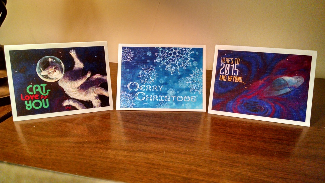
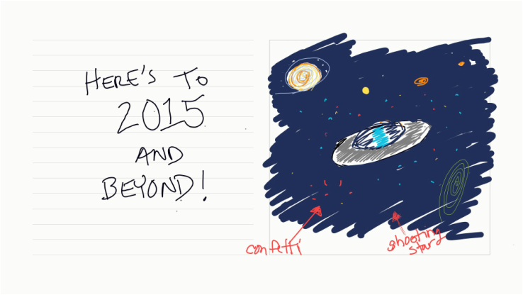
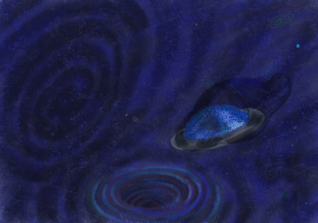
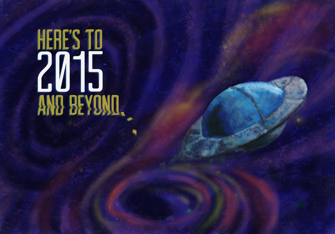
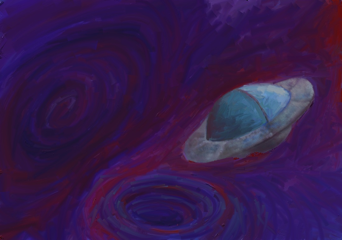
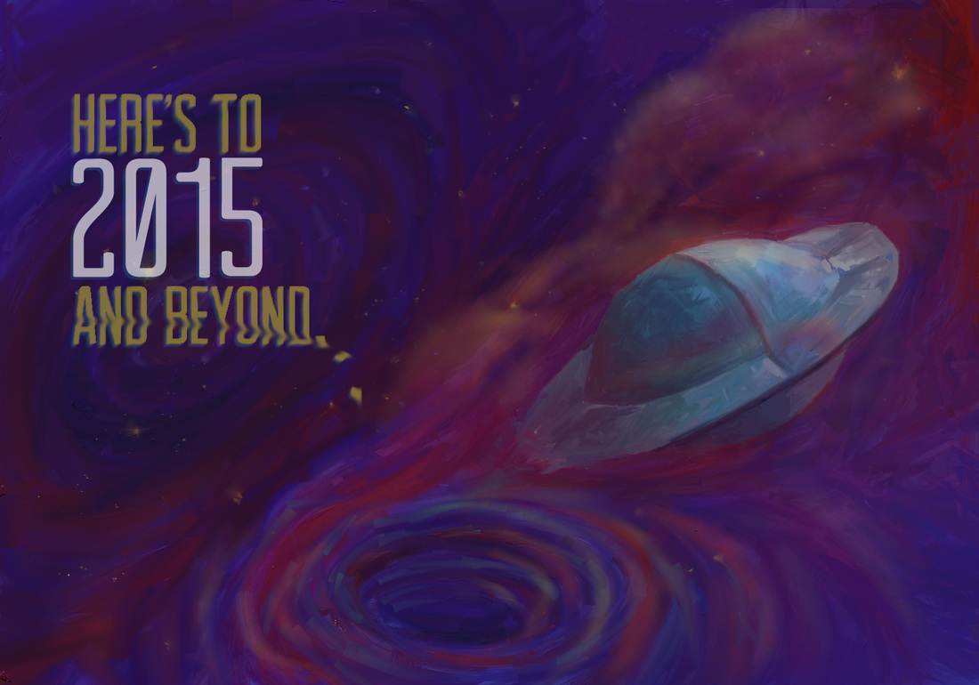
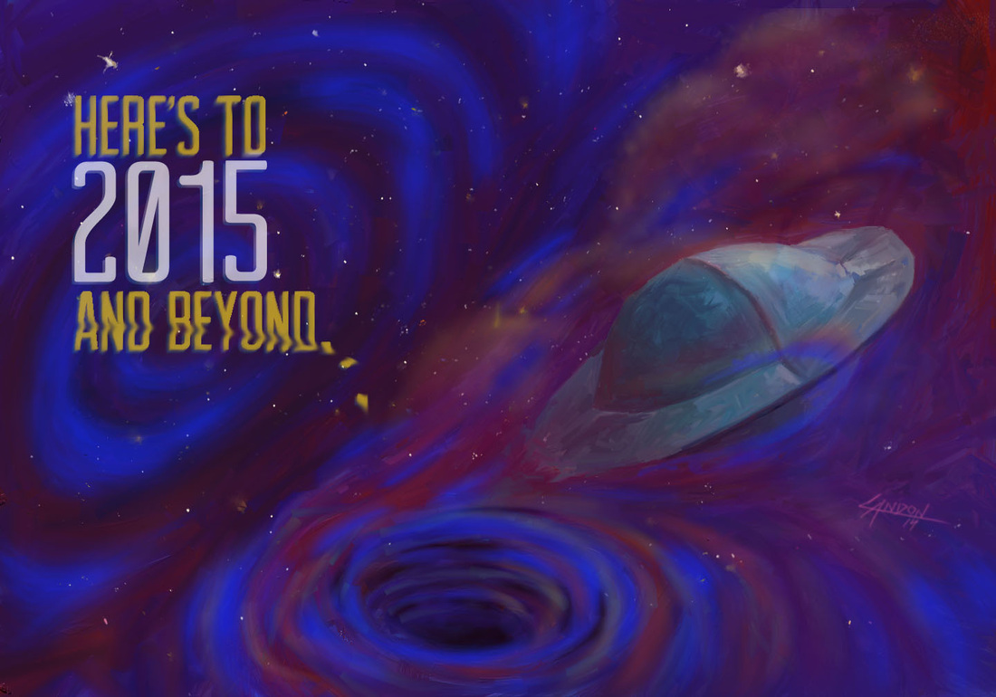
I finally finished my first series of illustrated holiday cards. Each image was digitally painted by yours truly. Some of the typography was also made from scratch by me (the Merry Christmas lettering was done by hand). The cards were printed on linen card stock with a color front and black and white back. The inside is free for you to inscribe whatever your heart's desire. Each week I will go through a card step-by-step so you can see how it was made. If you are interested on purchasing the cards I will ship them to you. I will provide a direct link to my online store at the end of the post. In this first image, I was simply fleshing out multiple ideas. I enjoy making the loose swirly ellipses you see in different colors. They make appearances in many of my sketches and final artworks. I briefly thought of making the stars confetti, but decided that would be too much.  Instead of using the Chalk brush, I decided to use the Oil brush. I love oil painting and the ability to mix colors on the canvas; ArtRage does a great job of replicating that feeling. I turned the swirly ellipse into a blackhole-like whirlpool at the bottom of the composition. I mimicked the whirlpool idea above and to the left, too. I just saw Interstellar in the IMAX theater. It was awesome. An experience rather than just a movie. There is something about the mystery surrounding black holes that really intrigues me, and everyone else I'm sure. Imagine if we knew everything about everything. What a crappy life that would be! I think the visual depiction of the black holes in Interstellar were truly awe-inspiring and deeply inventive. Onward and upward.. you can see that I am still testing out textures in the ArtRage program I am using. This was the first design I did and I had a lot to learn about my favorite new painting software program. The spaceship especially has some funky things going on with it texture-wise. The shape and size were off and I decided to do it as a separate painting then bring it into the spacescape. I printed the above image and realized that it was WAY too dark of an image to print properly. When you paint on a canvas that has a screen lit up behind it, it's hard to remember that when the ink sits on paper it will not have a 100-watt light bulb behind it. The colors are lost to darkness, too. I decided to repaint the entire image in brighter, lighter colors. Oh, I also turned my screen brightness down to less than halfway! I globbed on piles of oil paint using the Paint Tube brush and then switched to a very large Oil brush to start smearing the paint together. I went to the print shop to have some mock-ups made with the final image above. It printed dark. AGAIN! (My teeth are clenched and I'm shaking my head back and forth as I write this.) It's kinda painful when you spend so many hours on something and then have to continually tweak it just so that it prints halfway-decently! Here's the final image. I ended up taking it into Photoshop and airbrushing in some bright blues over the darkest parts of the spacescape. The printed version still looks slightly different than this, a little less whispy and the stars are a bit dimmer... But overall I am really happy with how it turned out!
|
Landon R. WilsonWelcome to my blog. Archives
September 2019
|

 RSS Feed
