|
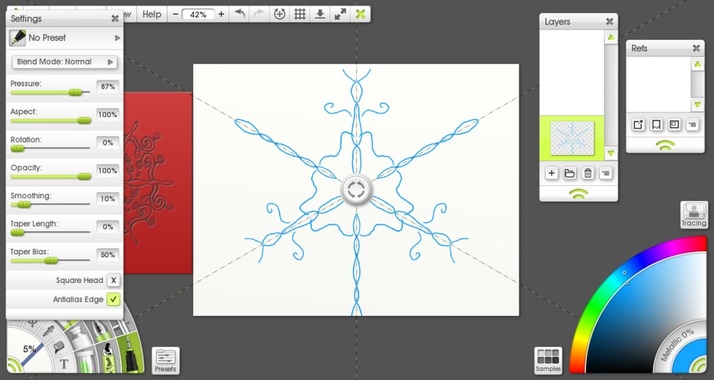
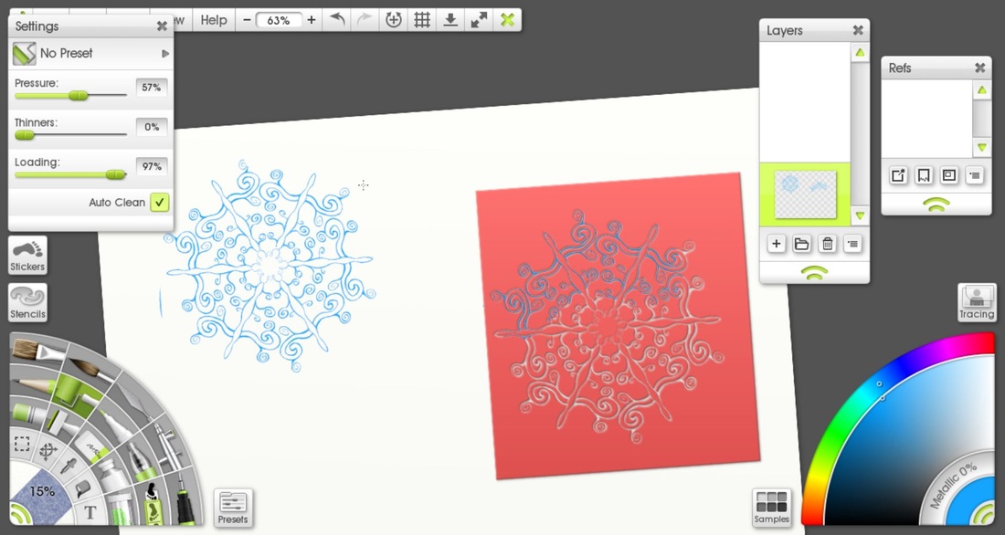
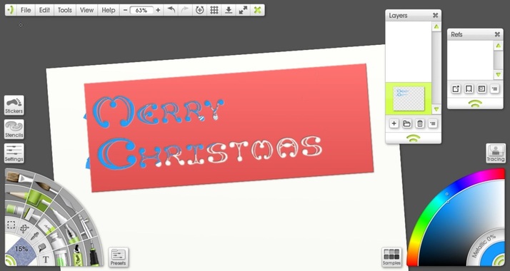
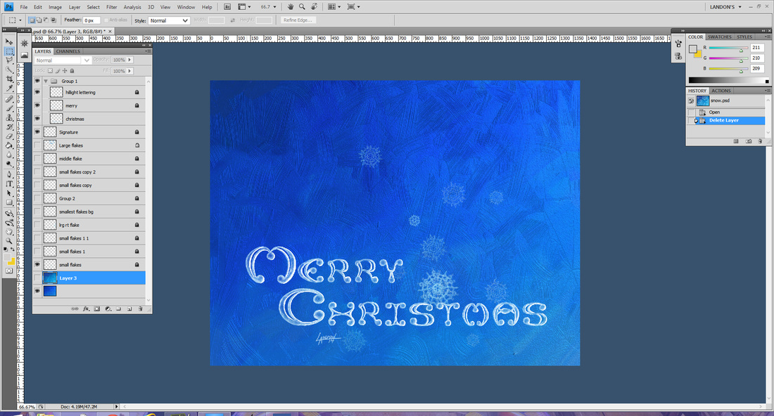
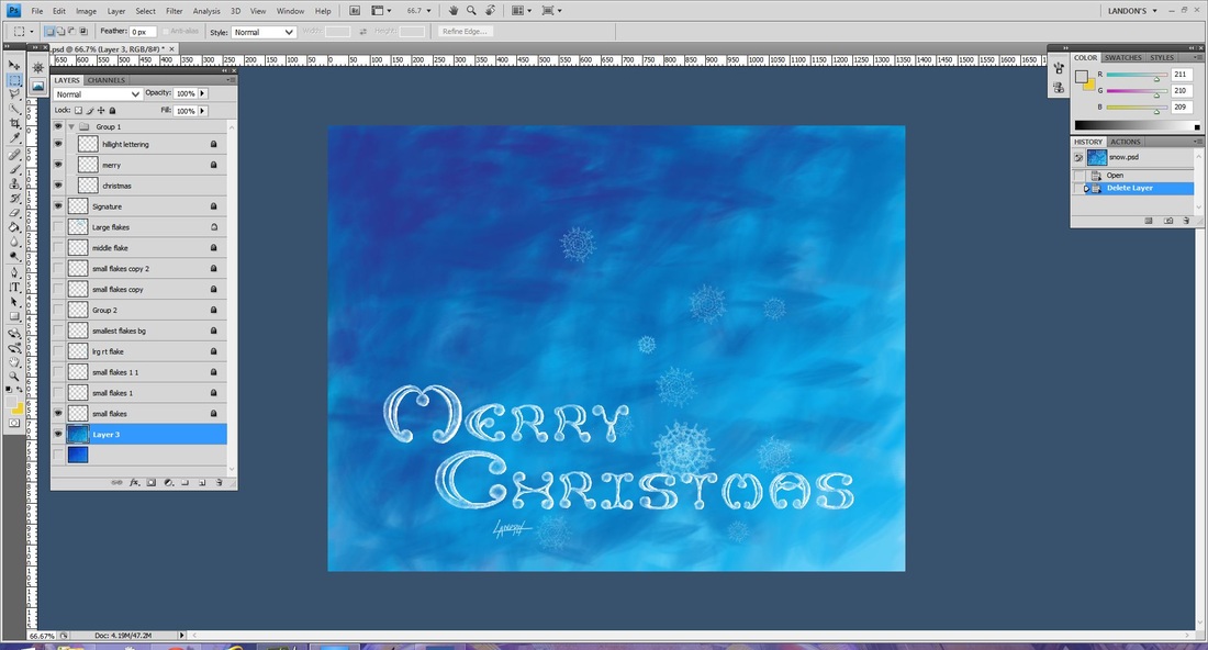
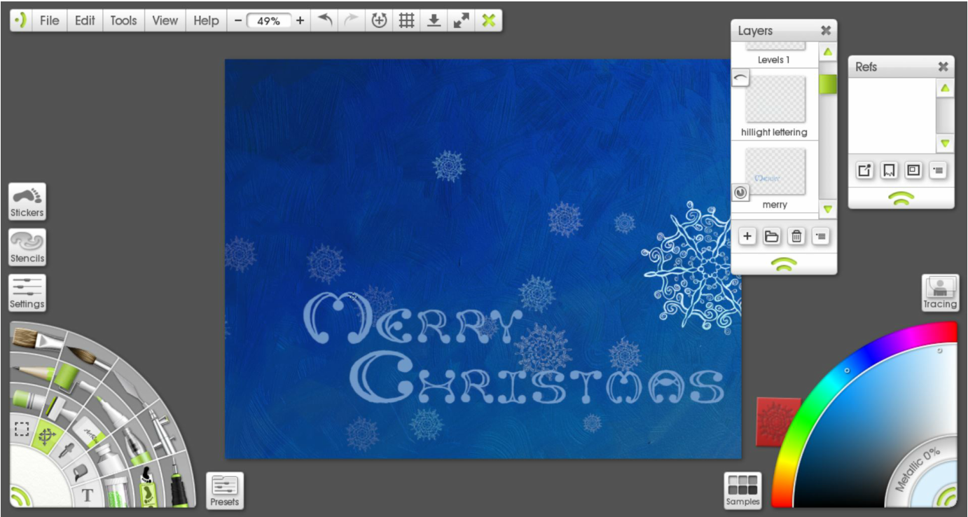
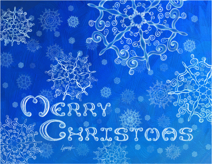
It's Christmas time again. A most wonderful time of the year. Cherished memories come flooding back to me as I'm bombarded by red bow after red bow. Gilded pine combs are in abundance; it's amazing what a bit of shiny paint will do to a decomposing piece of wood. It all makes me warm and fuzzy inside with hopes and dreams of creating new memories. It's mostly the niece and nephew that bring me happiness on Christmas morning now. Despite the rapid-fire opening of presents and nonchalant thanks that leave a lot to be desired, I still enjoy the quality family time. It reminds me of playing the lottery, really. Every year there's that one gift that makes their eyes gloss over and captivates their attention for the rest of the day. The only question remains... will it be mine this year? One can only hope. Well here is my last design for Christmas cards this year. I look forward to continuing this tradition and am excited for what I will do next year! I started off with the Paint Symmetry tool in ArtRage 4 (for the Desktop). I researched the fact that snow flakes are six-limbed. I changed how many axis' their are in the Paint Symmetry tool so that it mirrored my brush strokes six times over. Once I was satisfied with my design I made a Stencil with it. This allowed me to replicate the basic pattern over and over again easily and also scale it to any size I wanted. The lettering I did from scratch. It took a long time, like a really long time.. so long I don't want to admit it publicly. Unfortunately I don't have any process shots of that but basically I started drawing in pencil on one layer. I had to lay out two rulers and space each letter individually. Then on a layer on top I inked my design while continually tweaking the letters. Once I was happy with that I made a stencil so that I could move the type around anywhere I wanted to. Originally I planned to do this all in ArtRage, and I used the Oil Tube brush and splattered on thick gobs of paint and then pushed it around with a large Oil brush to create that nice gradient from dark to light. You can really see the texture of the brush strokes here. When I printed a test out it was barely noticeable that I had a gradient. You also couldn't see the texture in the brushstrokes. I decided to re-do the gradient in Photoshop. You can see the difference easily, there is no more natural looking texture and it is a different blue (It is Cyan so that the printer can replicate it properly.) I printed this and it looked pretty good. From there I just kept adding more snowflakes by copying and pasting, varying their sizes, opacity, and location until I was satisfied with the composition. For the snowflakes in the foreground I painted on top of the original stencil to change them so that there were little differences in each of them. Below is the final PRINT version. Compare the difference to the final Digital version which is below that. I may take next week off so Happy Holidays to you and your family :) May you feel loved and blessed as I do.
|
Landon R. WilsonWelcome to my blog. Archives
September 2019
|


 RSS Feed
