|
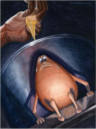
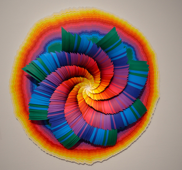
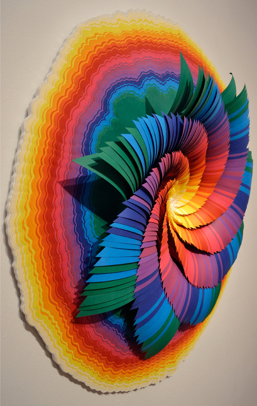
The toughest concept to grasp at art school was how to look at, and then talk about art. (It has proven to be the most useful.) An artist who has a trained eye is not a cliche. I remember one time my instructor Dennis Nolan told me how he saw red and blue in a picture of a chrome pot I was trying to paint. I agreed, knowing full-well that I did not see any of those colors. I took his word for it because he is a wizard, or at least so-called by his adoring students. I painted those reds and blues into that pot and boy did it turn out to be the best pot I've ever painted in my life! Not that I have many to choose from.  To Jump or to Fry 2011. You can see the red directly behind the egg and the blue to the left and right of it in the shadows. The idea behind this illustration was that the egg got away from the frying pan only to discover there was only one way out, and it was down. The point of that story is that NOW I can see those colors, too. I think a lot of it has to do with learning to mix colors for a painting. When I see a color, I always think about how it would be mixed if I were to paint it. Take a look at this work by Jen Stark. This is a pinwheel-like object that has about ten colors in it. See what I did there? I identified how many colors there are (well I guesstimated, a little bullshit never hurt anybody right?) Identifying what you are looking at is key. I know it seems obvious, but it is a crucial step! I guess you could say that it was the colors of the rainbow but if you wanted to sound artsy and in-the- know, you should go into a little more detail than that. I would say, "I like how the colors gradiate from warm to cool. [It appears that I have made up this word, as I can't get the squiggly red line to disappear from underneath it. I'm sticking with it though. Now everyone repeat after me--> Gra-di-ate = to radiate outwards (or inwards) a gradient of color and/or value] The circular shape has a gradient from light to dark as well as from white to yellow to red to violet to blue. An easier way to describe this phenomenon would be to say it went from warm (yellow-orange-red) colors to cool (blue-green-violet) colors. The pinwheel shape of the inner part of this piece has a color scheme opposite to that of the outer circle. It moves from cool colors on the outside to warm colors on the inside. Here is a bit of a trick question for you. Is the center of the pinwheel cool or warm? Well, for starters, what color is it? Or is it even a color at all? That last one was just to mess with your head. The center is white and for our purposes we won't debate whether white is a color or not. Warm and cool is RELATIVE! Thank you Doug Andersen for drilling that into my head! The white appears cool in this artwork because it is next to a warm yellow. By the way, the title of the piece is called Glow. It was made in 2014. I always look at the title of the artwork last. I guess it gives me the ability to see it in an unbiased fashion, sometimes artist's titles suck. (YES, even mine.)
|
Landon R. WilsonWelcome to my blog. Archives
September 2019
|


 RSS Feed
