|
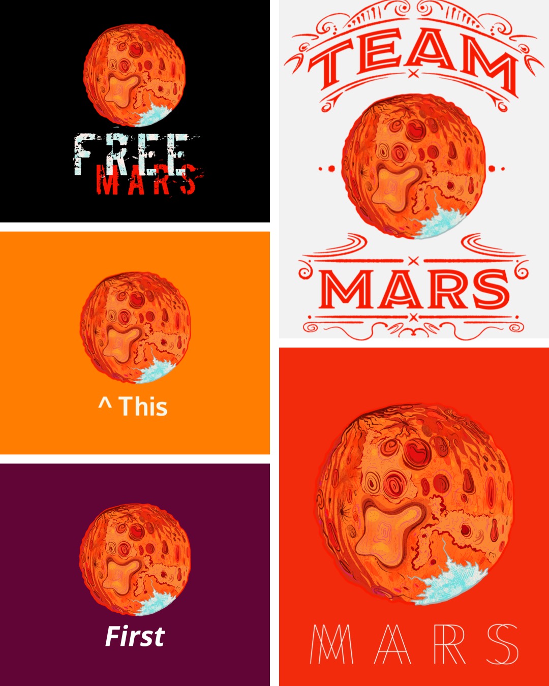
I made some stuff for print-on demand sites like RedBubble recently. I started with some short term goals I wrote on paper... iPad paper. 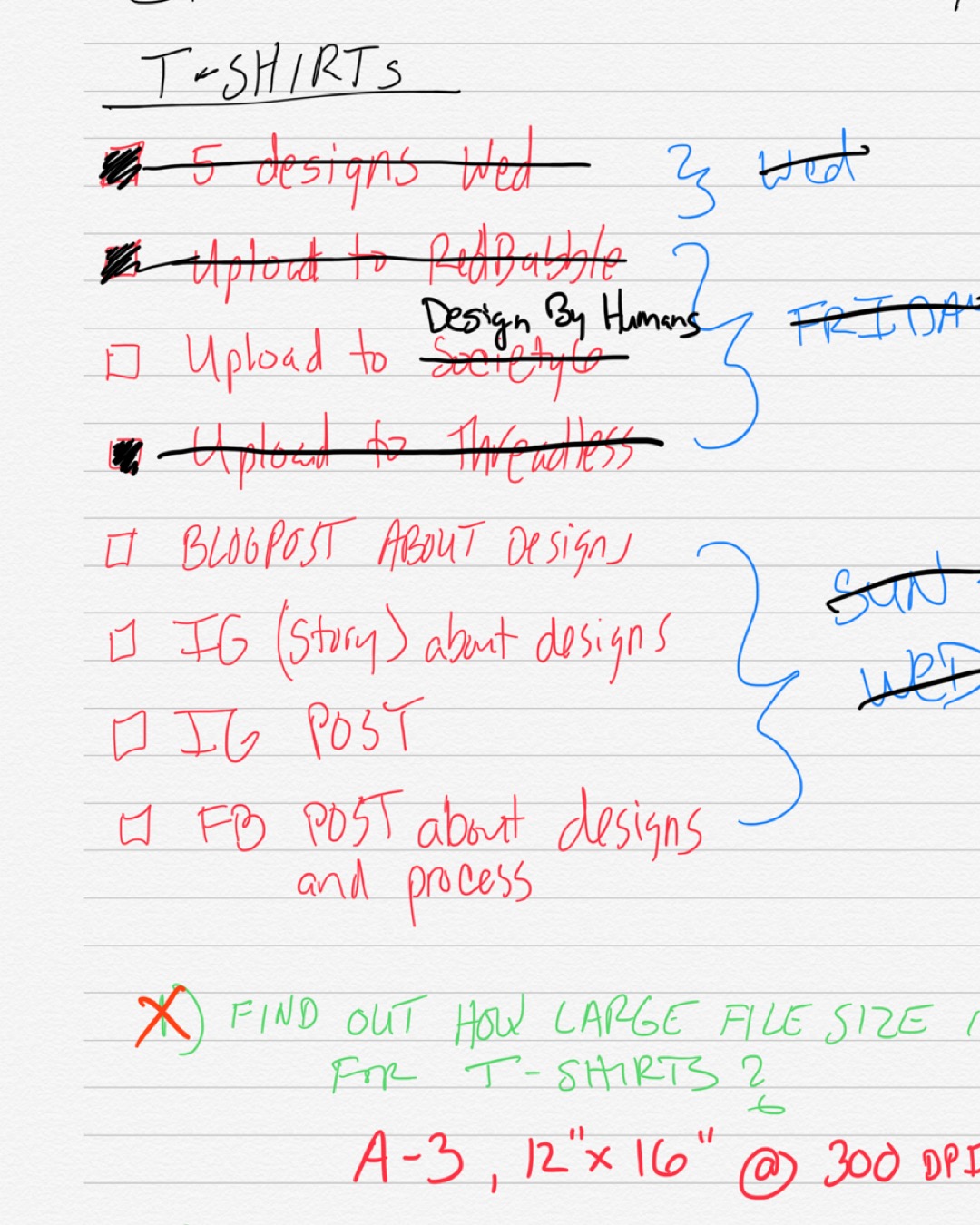 I started with a watercolor illustration I made a few years ago. I love space, sci-fi, and Mars seems like a popular enough subject that I might make sales to randos xD Soon I was overwhelmed and didn’t know what to do next, so I got inspiration and education from YouTube videos. I made a list and prioritized it. I exported my Adobe Illustrator Draw vector file from the iPad to a PSD in Photoshop. It was converted into a smart object so I could scale it. Then I added textures using Kyle’s Brushes and my own custom textures I made with the Adobe Create app from photos taken during a hike through Griffith Park and the Old LA Zoo. I added embellishments and played with different fonts and layouts for designs using Photoshop. Illustrator is above my pay grade, lol, so PS works fine for me in this situation. Here are some of the designs I came up with and some copy I wrote for each design. It was fun to come up with a little story for each one!
So with one 3 year old illustration I was able to turn that into 5 separate designs to go on 30-plus products to be sold. Speaking of which, if you want to support me, you can by clicking on this link and buy yourself a T-shirt or something. Thanks. :) There is more to come. 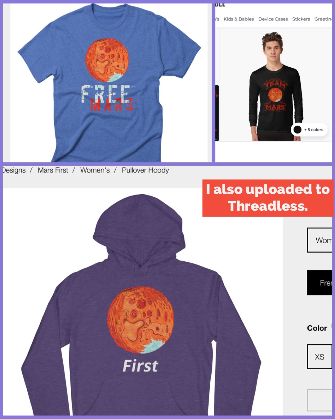 I paid upwards of $50 to hear a lecture. About science. At a casino. That is capitalism for ya! It truly is amazing to be in a crowd of a thousand geeks, nerds, children, teachers, and just general people excited about astronomy. If you've seen the Cosmos on Fox (it's streaming on Netflix now) then you may be familiar with who I saw. It would be one, Neil Degrasse Tyson. He is an Astrophysicist, Director of the Hayden Planetarium in New York City, and general celebrity scientist extraordinaire. The talk was somewhat repetitive if you've seen the Cosmos, however, he did broach the subject of earthquakes, considering our recent scare in Eastern CT. IT IS A SCARE, by the way. He showed us that in the same one week period, California had something like 2,000 earthquakes under the 3.3 magnitude; meanwhile, a year previous, there were [slightly] more earthquakes in that same week in California and the East Coast. It's nothing to shake a stick at. I was incredibly inspired by the talk. Neil is an incredibly charismatic and captivating public speaker. The best part was during the Q and A. There was a number of children who asked questions, or told [bad] jokes, as it were. I enjoyed the somewhat awkward, geeky guys and gals reading three paragraph questions off of their iPhones. Overall it was extremely inspiring. I have been cruising through any Astronomy media I can find on YouTube and Netflix since then. Here is one I have found particularly fascinating. The instructor Chris Impey has a way of adding in tidbits of information that really makes you want to know what he is going to say next. The first lecture is an awesome introduction to the basics of Astronomy, with many sidebars on the history of mankind and our many civilizations. I highly recommend it. I was inspired to do this planetary landscape. I imagine the surface to be completely encompassed by this red liquid that has worn down the rocks over thousands of years, but they are still slightly porous-looking. Maybe there is a bacteria in the water that is surviving in the gas-filled atmosphere. (I was thinking Helium but I haven't researched to see the IF's, HOW's and WHY's of that.) 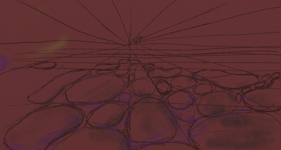 I added texture to the rocks and most of this gaseous atmosphere. I stayed with the same hue (maroon.) 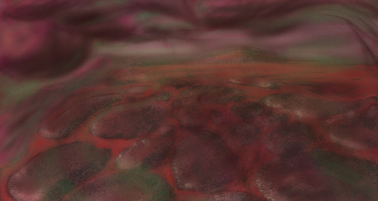 Here's your basic perspective sketch. VP stands for Vanishing Point, all roads lead there. I started with a maroon background instead of white. That is unusual for me but I think that helped this image a lot. 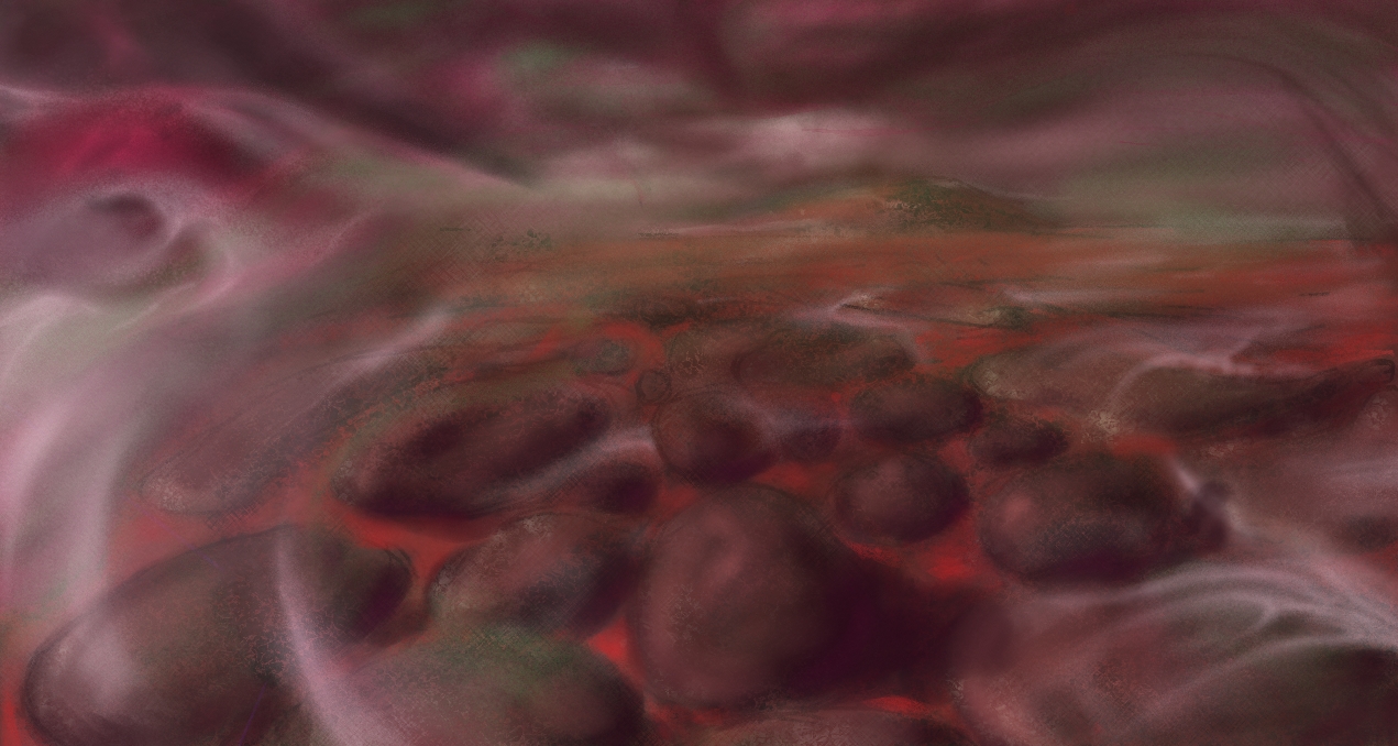 The clouds were not very good originally, so I took a picture while at work of some stormy clouds and used that as reference. I also added some mist being swept across the liquid-filled lands. 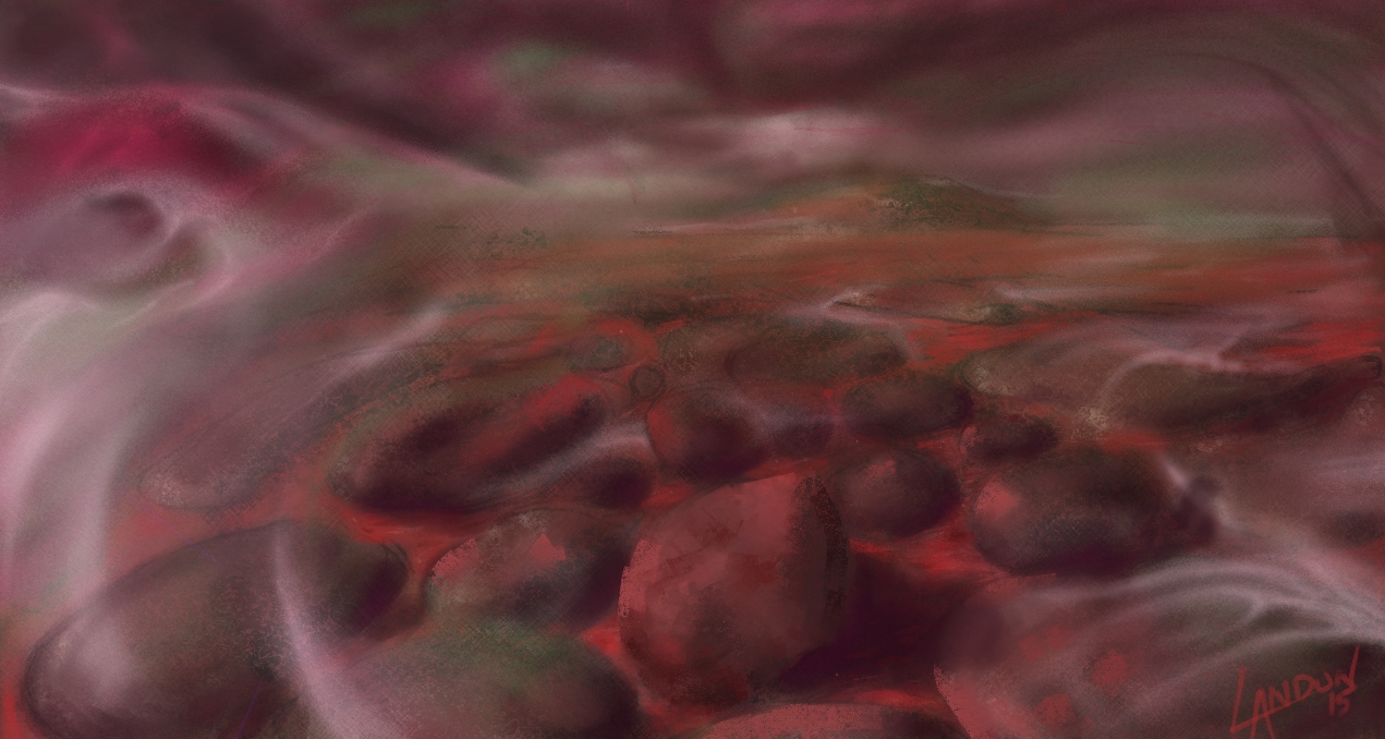 Here I added some highlights on the rocks. I also tried to make them more 3-dimensional; however, I didn't draw them like that originally and I wish I had now!  I could work on this for longer but sometimes you have to call it quits and this is just a sketch after all. I added some more pencil texture and highlights to the rocks and the liquid. Overall, I really like the idea of this planet and could see it fully-realized sometime down the road.
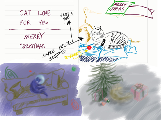 On top is the original idea I had. I was cat-sitting for my girlfriend's parents and I was inspired to draw "Mittens" from life. I grew quite fond of her the three weeks she was with us and I'm not ashamed to say it anymore! The bottom right was another quick sketch done in Photoshop. I quickly realized I wanted to do away with the more common Christmas themes; in the bottom left I cemented the space idea. The thumbnail contained a couch which I was told by Julia that it made no sense in space so I got rid of it,too. One of my mantra's is, "If it's too simple, simplify it more!" But sometimes it takes someone else to remind me of that! (I still think a cat on a couch floating in space is a funny image.) Once I cemented the cat lost in space idea, I googled "cat in space" to see what else was out there. Well, believe it or not, there's apparently hundreds of thousands of cats flying out in space at this very moment... Most of them are really bad Photoshops though. I wanted to have a very lonely cat and considered having Earth in the background to portray this. I also wanted to portray the fact that the cat was lit by the sun it was inching ever so closely towards. I decided to eliminate a [large] Earth in another effort to simplify. 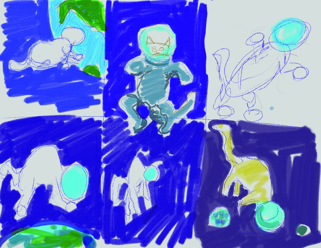  I tried doing most of this painting in Photoshop originally. Printing the other two cards made me realize I should try and keep the colors in the CMYK range rather than web colors RGB. You can't do that in ArtRage. (For those who don't know, when printing artwork, etc.. the printer usually only has 4 colors to choose from. When you buy a cartridge from Staples for your computer you are buying the colors Cyan, Magenta, Yellow, and Black. There is a limited set of colors that you can mix from this, I find that blues are especially difficult to match. RGB contains basically all the colors we can see. As an artist and illustrator, there is always a battle to reproduce artwork on paper as it is on canvas, or monitor, or whatever.) Anyways, I still find Photoshop confusing and un-intuitive so I decided to do it over in ArtRage for a more controlled but painterly feel. 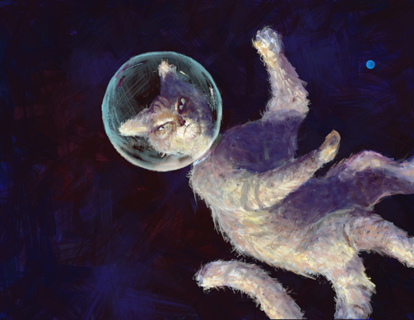 I liked the warmth of the orange cat in the image before this one but thought it stood out too much. This is space and there is not a lot of light out there, which means there is not a lot of color, too. I liked how the ArtRage program gave me the control to produce a kind of ratty looking cat. You can see I still had a small earth in the right corner. I printed this and saw that it was too dark, of course. 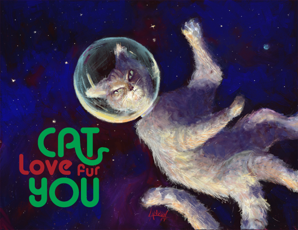 I added some brighter blue to the background and some bright stars to really get the spacescape going. I did the type in Adobe Illustrator and spent a good amount of time playing around with the way the "A" in cat mimicked a cat's tail. There was a point where it looked more like a snake than a cat's tail! Originally, it was planned to be Cat love FOR you" but at the very last minute the "fur" pun came to me. I definitely feel that this is a successful image and I am completely happy with it! (I can't say that about a lot of things I've done)
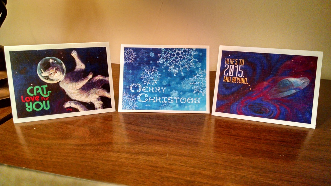 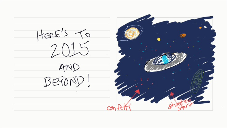 I finally finished my first series of illustrated holiday cards. Each image was digitally painted by yours truly. Some of the typography was also made from scratch by me (the Merry Christmas lettering was done by hand). The cards were printed on linen card stock with a color front and black and white back. The inside is free for you to inscribe whatever your heart's desire. Each week I will go through a card step-by-step so you can see how it was made. If you are interested on purchasing the cards I will ship them to you. I will provide a direct link to my online store at the end of the post. In this first image, I was simply fleshing out multiple ideas. I enjoy making the loose swirly ellipses you see in different colors. They make appearances in many of my sketches and final artworks. I briefly thought of making the stars confetti, but decided that would be too much. 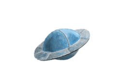 Instead of using the Chalk brush, I decided to use the Oil brush. I love oil painting and the ability to mix colors on the canvas; ArtRage does a great job of replicating that feeling. 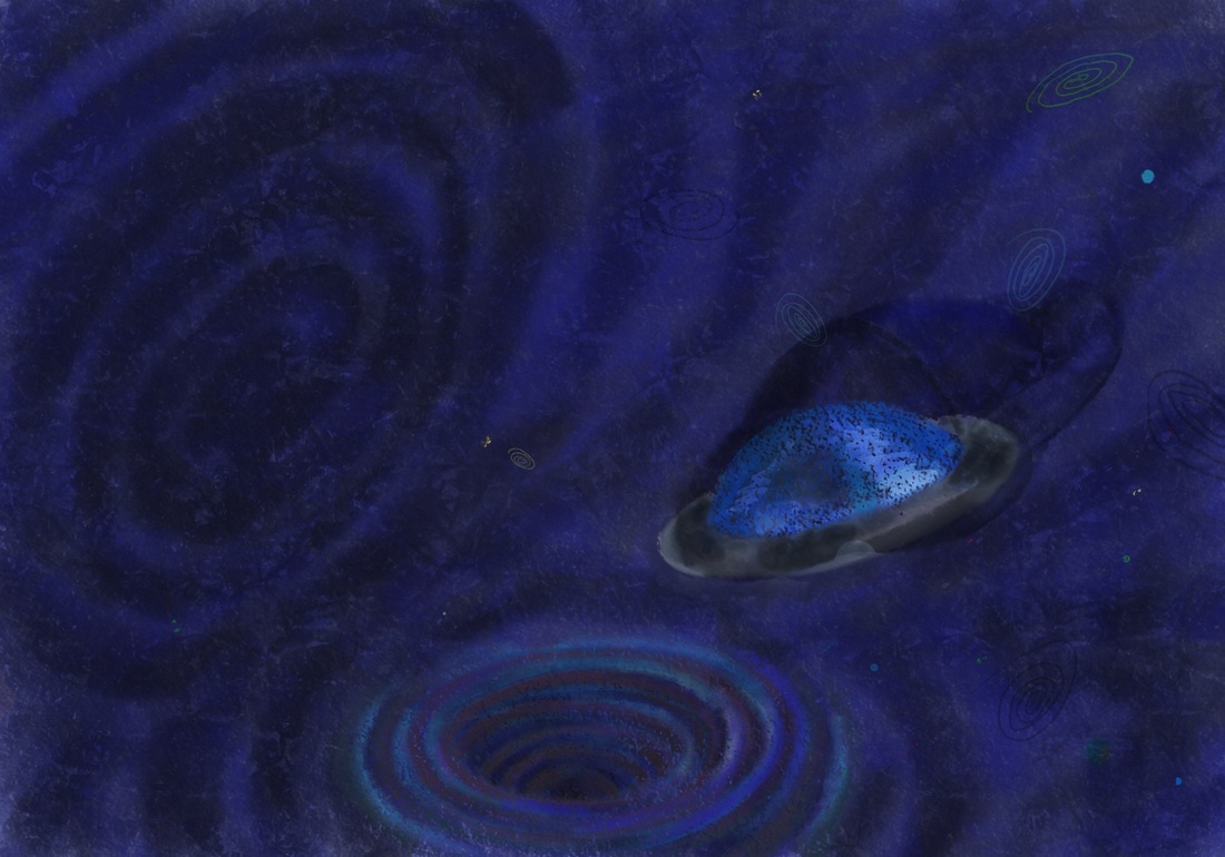 I turned the swirly ellipse into a blackhole-like whirlpool at the bottom of the composition. I mimicked the whirlpool idea above and to the left, too. I just saw Interstellar in the IMAX theater. It was awesome. An experience rather than just a movie. There is something about the mystery surrounding black holes that really intrigues me, and everyone else I'm sure. Imagine if we knew everything about everything. What a crappy life that would be! I think the visual depiction of the black holes in Interstellar were truly awe-inspiring and deeply inventive. Onward and upward.. you can see that I am still testing out textures in the ArtRage program I am using. This was the first design I did and I had a lot to learn about my favorite new painting software program. The spaceship especially has some funky things going on with it texture-wise. The shape and size were off and I decided to do it as a separate painting then bring it into the spacescape. 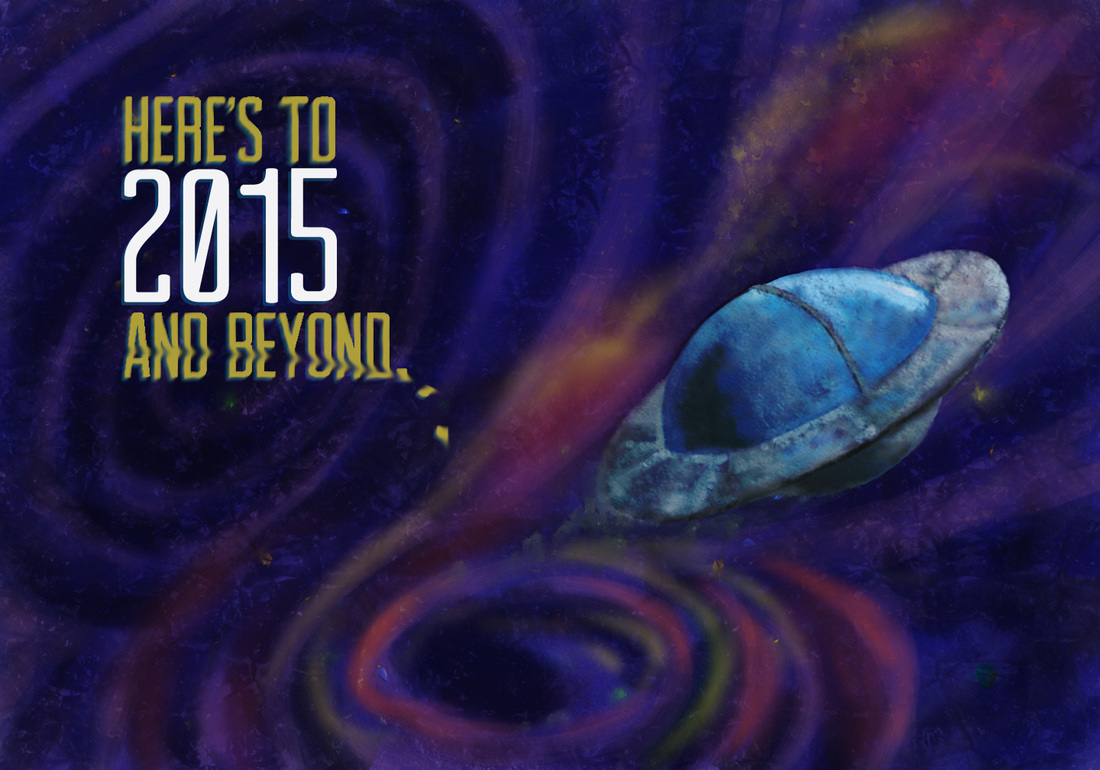 I printed the above image and realized that it was WAY too dark of an image to print properly. When you paint on a canvas that has a screen lit up behind it, it's hard to remember that when the ink sits on paper it will not have a 100-watt light bulb behind it. The colors are lost to darkness, too. I decided to repaint the entire image in brighter, lighter colors. Oh, I also turned my screen brightness down to less than halfway! 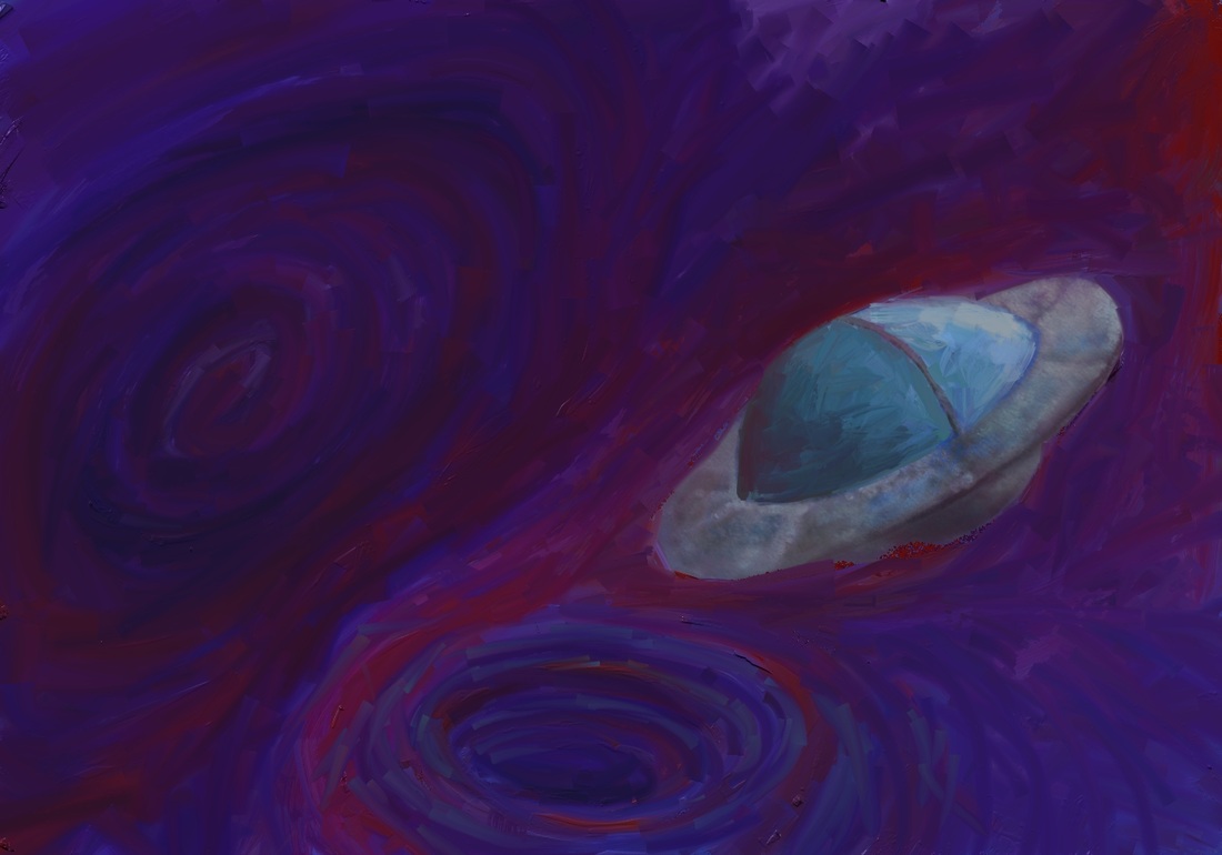 I globbed on piles of oil paint using the Paint Tube brush and then switched to a very large Oil brush to start smearing the paint together. 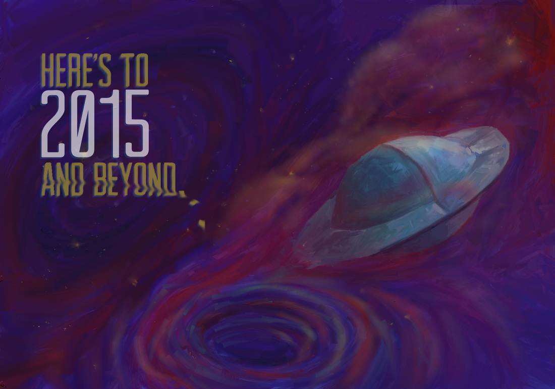 I went to the print shop to have some mock-ups made with the final image above. It printed dark. AGAIN! (My teeth are clenched and I'm shaking my head back and forth as I write this.) It's kinda painful when you spend so many hours on something and then have to continually tweak it just so that it prints halfway-decently! 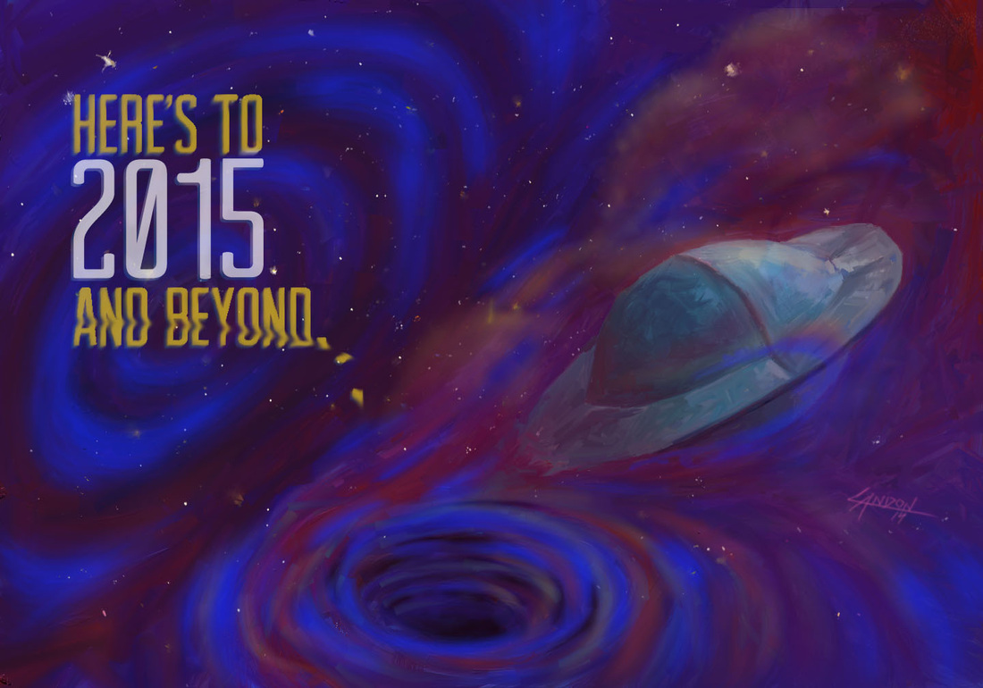 Here's the final image. I ended up taking it into Photoshop and airbrushing in some bright blues over the darkest parts of the spacescape. The printed version still looks slightly different than this, a little less whispy and the stars are a bit dimmer... But overall I am really happy with how it turned out!
|
Landon R. WilsonWelcome to my blog. Archives
September 2019
|

 RSS Feed
