|
Good Afternoon, I hope you are enjoying your Thanksgiving day with your friends and family. I am sure I will be stuffed with turkey, and hopefully asleep by the time you read this... God bless the retail system in America! It provides us with jobs, friends, and countless fire code violations on Black Friday, errr Thursday. To those of you who go and shop before it officially strikes Friday... SHAME ON YOU! Also... HELLO! Because I will be seeing you from the other side of the cash register, luckily, not until 1 a.m. though, if you can call that luck? END RANT. Now on to the fun stuff. 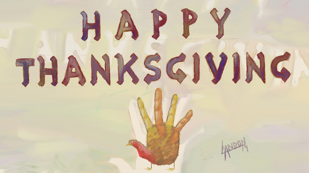 I made this for you and only you! Kinda. It was good practice for me, too. I did some hand-lettering and some hand-painting. Hopefully that's not too punny for you. Seriously, thank you for your support, well-wishes, comments, and emails; it really does mean a lot to me and I'm thankful that YOU ALL are in my life :) It's come to my attention that this breed of turkey is usually made by tracing a hand. Well, that is not the case here. My turkey is special, it's hand-drawn with no tracing help at all! (I should hope that after $30k in tuition, I would know how to draw a hand. Thank you Illustration Dept. at Hartford Art School) I held my left hand out in front of me and sketched with my right hand. Here's how I did the rest: 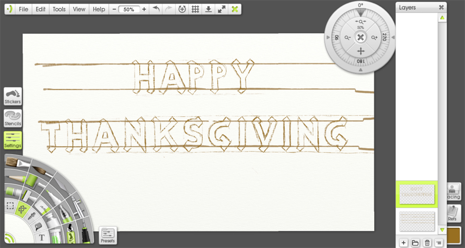 I started by drawing normal block letters along 4 guide lines. I added the extra triangles afterwards, not knowing how they would fit on each letter until I tried. 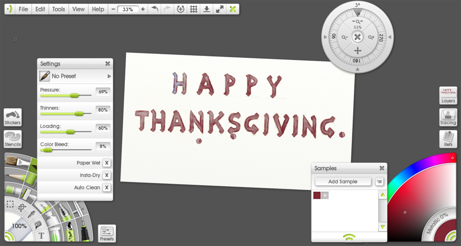 So I painted in the lettering with a maroon color. I tested some blue to the first "T" and liked how it looked so I continued with that below. 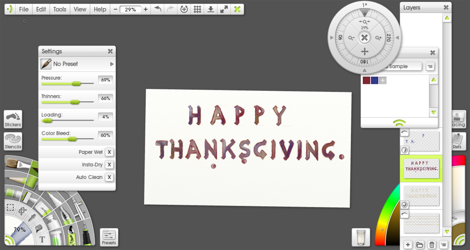 I also added some to the lettering. The splotches, by the way, are caused by my palm touching the screen before the stylus (pen) is close enough to be registered by the computer. Otherwise, I can rest my palm there if need be. 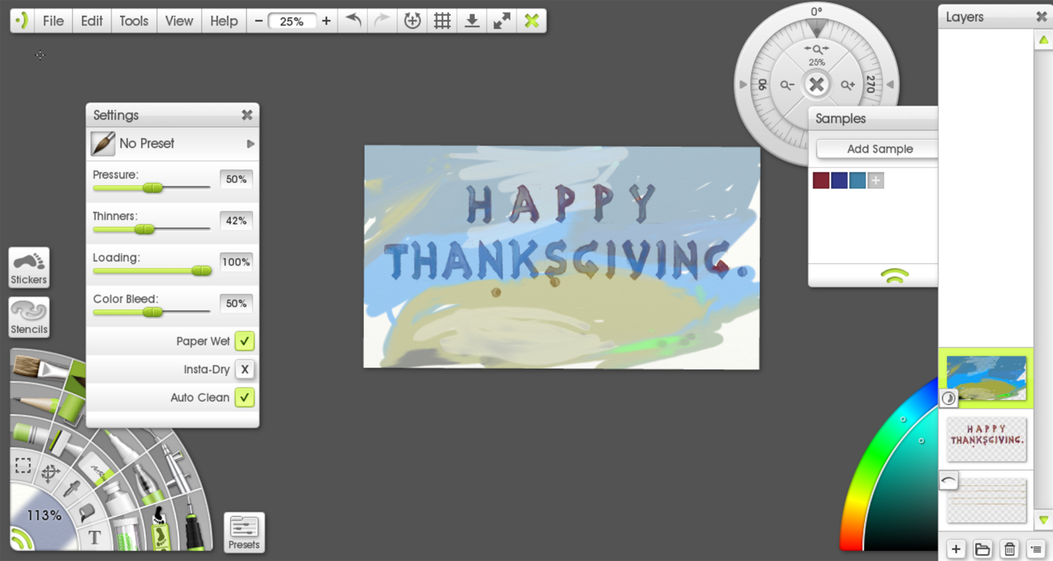 Here is a failed attempt at making a nice watercolor-like background. I have a lot to learn when it comes to digital painting. I ended up setting the Layer to Difference which somehow made my colors opposite of what I actually chose. So if I chose blue it ended up being yellow (almost complementary, but not always) and vice-versa. Needless to say, it was a little annoying but it gave the right watercolor look to the painting.d  I spent a lot of time painting around the letters on the Difference layer and then ended up accidentally moving the layer. I liked how it looked so I decided to keep it. (I also had already saved and did not feel like going back to a previous save to do it again.) Anyways, thats why you can see an empty outline of the lettering and turkey. I liked it, what do you think?  Before I forget, the program I am using is ArtRage 4. I am using a watercolor brush on watercolor paper. Thanks again for being here and have a wonderful turkey day!
When it happens, you'll understand exactly what it means. Until then, read this. I first heard about it when I visited the Yale Art Gallery with my friend Ursa and she described this moment she had with a Jackson Pollock. I thought she was a bit crazy at that time. I mean, who really has a moment with an inanimate object? Of course this was a time in my life before I really believed in art. I was just realizing that what I was doing in my life was not working and something had to change. I was exploring again. I had decided to take some drawing classes at community college mainly to relieve the monotony of my life. At any rate, I didn't believe Ursa until it happened to me. It was at the Museum of Fine Arts in Boston and it was a John Singer Sargent that did it for me. There is a couch in the gallery in front of this massive square-shaped canvas. To its left and right are Chinese vases that stand five feet tall. They are the actual vases from the painting. The gallery space immediately demands your attention because of these massive artworks. I sat down and began to ponder why this painting was there. Before I knew it, forty minutes had passed. I don't really remember what happened during those forty minutes; people were simply a blur on the edge of my periphery, like I was dreaming and I couldn't actually distinguish faces. From that experience I knew I had to see the painting again. I became a member to a museum that was a two hour drive from me! 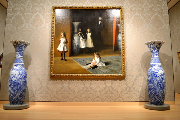 DISASTER! The next time I went back to the MFA the painting was gone and it left a small hole in my heart. It was on loan to another museum. It''s been a long time coming for me to see that painting but I was able to again last month when I visited the MFA with a few friends. They can confirm that I made a beeline to the painting 45 minutes before the museum closed. I don't think they realized, nor did I, that I would be sitting on the couch staring at that painting until they ushered me out, but that's how it happened. The painting's got a hold on me! I'd like to try to put into words why. 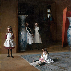 John Singer Sargent The Daughters of Edward Darley Boit Oil on canvas 1882 Image courtesy of Wikimedia Commons There are four daughters in the painting. Two in shadow, two in light. During this second epiphany, while letting the painting envelope my brain, I did my best to take mental notes to analyze later. I was incapacitated to the point where I was incapable of taking written notes and/or sketching. When I moved closer to the painting (just a foot or two away) the young one sitting on the carpet was staring at me. When I sat back down, the one leaning against the wall to the left began to stare at me while the others looked away. It was creepy and captivating at the same time. 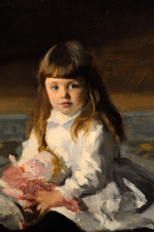 The one leaning against the vase so casually, not even bothering to look at the camera. The father's nightmare... imagine the attitude on her! Then you have her sister next to her, standing in the shadows, almost as if she is a ghostly figure from a horror flick. I'm not really sure if I'm suppose to see her. She only stared at me when I was standing up and about ten feet away. 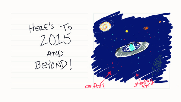
Here's a sneak preview of an initial sketch for a holiday greeting card series I am thinking of producing this year. I would love to have your thoughts and input in the comment section. This was done on my VAIO Paper application I use for taking notes, making lists, and generally staying organized on my laptop. I can't describe the satisfaction I get from completely erasing the task, as opposed to scratching it out with line after line of ink. Oh, how I love my OCD! I am thinking of doing 3 designs this year, maybe more, depending on time AND your interest! I am also thinking of doing some sort of cat design, too. I have despised our little feline friends ever since I can remember waking up to the neighborhood strays laying on the hood of my first, second, and third cars. And then I bought the house that the neighborhood strays came from. (The cat hoarder.) The smells from that house still haunt me in my dreams. I sanded the floors with a large (rented) orbital sander to get the cat urine stains out (among other things.) In a particularly bad area near the backdoor, the sander kicked up so much dust that even with a mask over my face I could feel the putrid smell of ammonia overcome me. To escape passing out from the fumes I ran outside and left the orbital sander spinning hectically in the kitchen. 
Why am I telling you all of this? Because despite all of this damning evidence, I caught myself feeling warm and cuddly inside after looking at pictures of cats on the internet yesterday. You let one six-toed cat stay with you for a couple weeks and that's how it happens. Let this be a warning to the rest of you NON-CAT LOVERS. Stay strong, cats have a power like no other...
CWOS is a month-long art festival in New Haven. This past weekend I saw a lot of art and met with many artists and friends, some new and some old. It was a good time and if you have the chance you should check it out. I wanted to talk about a few of my favorite pieces this week. 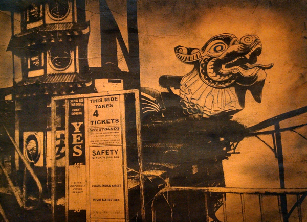 This is by Claudia Cron. I love the color yellow. That is one reason why this artwork resonates with me. Another is that it is a very high contrast image, there are basically only two values. A very dark black, and a very light yellow. I also like the way the background "gradiates" around the dragon head. 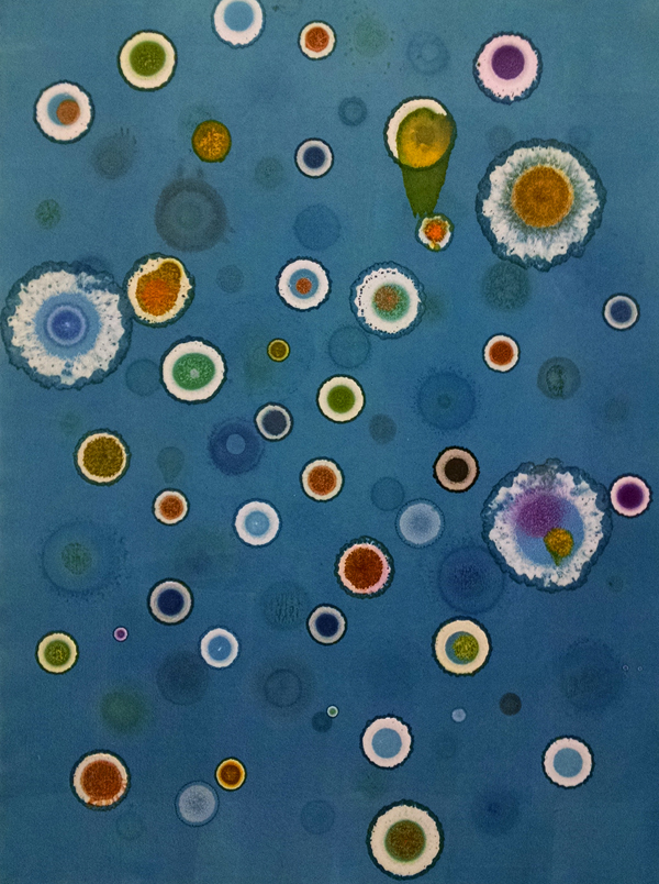 This is by Thomas Stavovy. The first thing that arrests me about this piece is the wonderful shade of blue that conjures up underwater images in my mind. The variation of value, color, saturation, and size is very pleasing to my eye, too. It creates a sense of depth that allows my eye to wander from circle to circle without wanting to stop long enough to distract me. 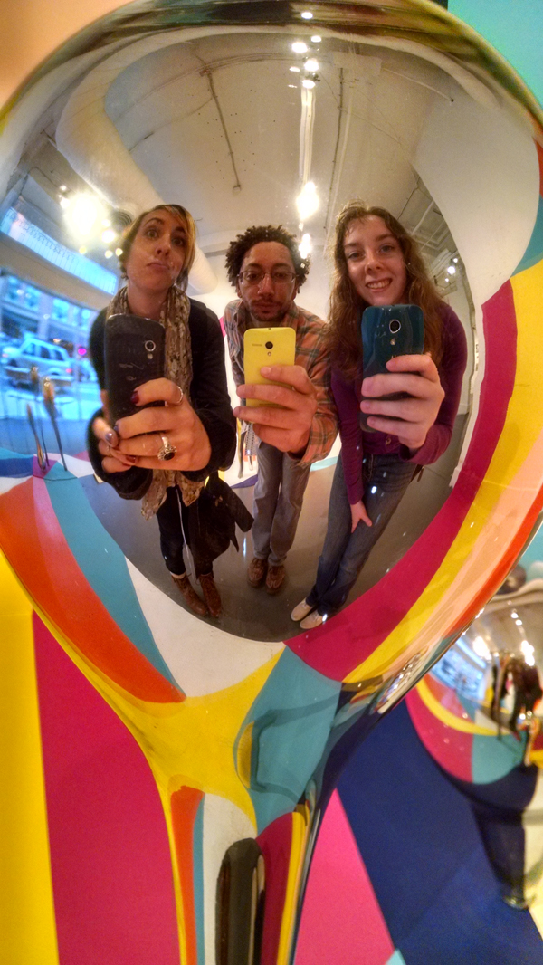 Where else are you going to be able to find three selfies at the same time. That's why I love looking at art, it changes my perspective of my surroundings. This particular sculpture was an installation in one room of the Artspace gallery, where one piece from each artist participating is on display. I like the use of saturated colors and mirror surfaces on organic objects that really adds a sense of whimsy. WE NEED WHIMSY IN OUR LIVES! There's too much death, politics, and taxes not to have it.
I feel like value is the most important aspect of an image. That's probably why I saved it for last in my three part series How to Talk about Art. Value is what leads the viewer's eye to the focal point. Without value your eye wanders aimlessly. The best way to see value is to squint. In fact, the best way to see anything is to squint. It is how artists see the basic shapes when they draw from life. 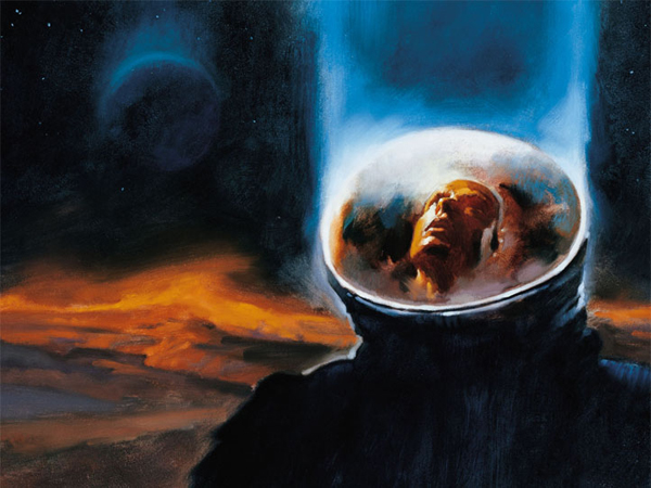 Greg Manchess Not sure of title or date. This is one of my favorite images. It is arresting because it makes my eye go directly to the astronaut's face, which seems to have a look of awe on it. Here's the reason why. 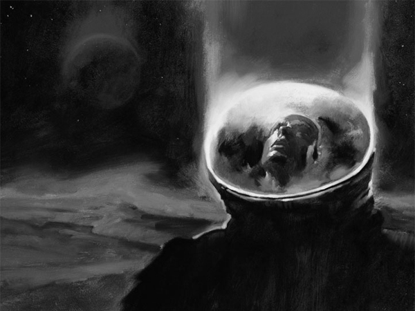 When you look at it in gray-scale, it is easy to see the darkest value is the astronaut's suit. It's basically black. This contrasts with the value of the astronaut's helmet, which is basically white. My eye goes straight to the area's of greatest contrast, (so does yours!) 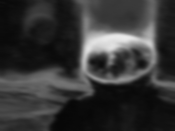 Even when this image is blurred-out you can still make out everything because each shape has it's own distinct value. The astronaut is extremely dark. His helmet is extremely light. The planet he is on is a lighter mid-tone whereas the planet in the distance is a darker mid-tone. The sky is almost as dark as the astronaut.
Shape is another important aspect to art. It is easy to talk about and sometimes overlooked. Let's take a look at another artwork from the exhibition somewhere between creation and destruction. [On view at the Joseloff Gallery at UHart until October 26th] It is an exhibition where artists have used cut-paper to create various works of art. 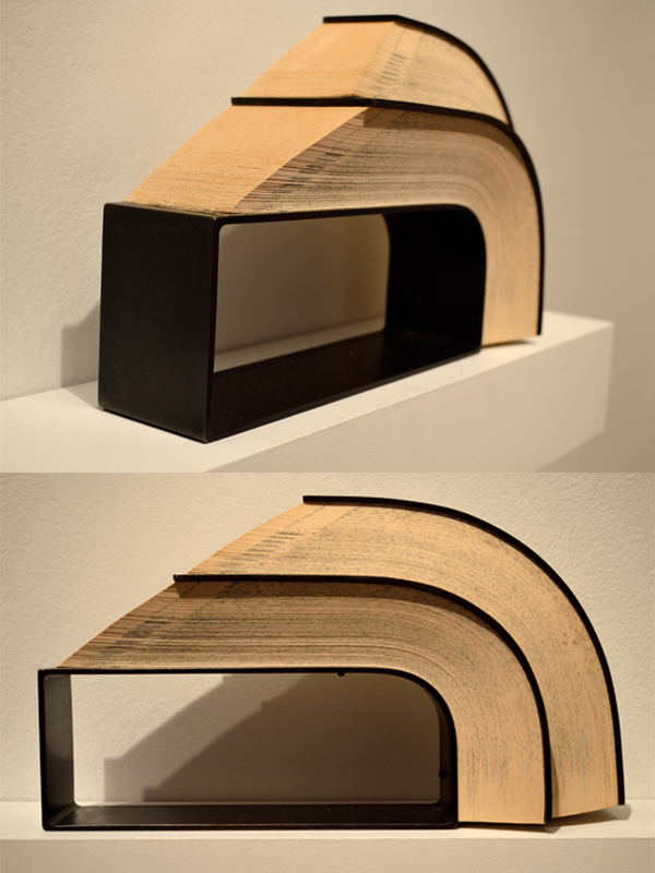
 This has a rectangular shape made out of iron. It looks industrial to me. Industrial is ARTspeak for anything that is made out of metal and/or rusty. (See-that's where the bullshitting comes in.) The overall shape reminds me of a house. Take a look at this work-of-art I made. (I use work-of-art very loosely here.) What does Comber remind you of? I would describe the shape below as a very long, sinewy shape. The fact that the artist chose a single color (black) makes the silhouette the focal point of the piece. The back side of the paper is painted in red and green. You can see the red and green light bounce off of the gallery wall which aids in the silhouette effect. 
Shape is an important aspect of any work-of-art; don't forget to talk about it!
The toughest concept to grasp at art school was how to look at, and then talk about art. (It has proven to be the most useful.) An artist who has a trained eye is not a cliche. I remember one time my instructor Dennis Nolan told me how he saw red and blue in a picture of a chrome pot I was trying to paint. I agreed, knowing full-well that I did not see any of those colors. I took his word for it because he is a wizard, or at least so-called by his adoring students. I painted those reds and blues into that pot and boy did it turn out to be the best pot I've ever painted in my life! Not that I have many to choose from. 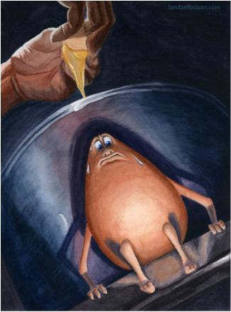 To Jump or to Fry 2011. You can see the red directly behind the egg and the blue to the left and right of it in the shadows. The idea behind this illustration was that the egg got away from the frying pan only to discover there was only one way out, and it was down. The point of that story is that NOW I can see those colors, too. I think a lot of it has to do with learning to mix colors for a painting. When I see a color, I always think about how it would be mixed if I were to paint it. 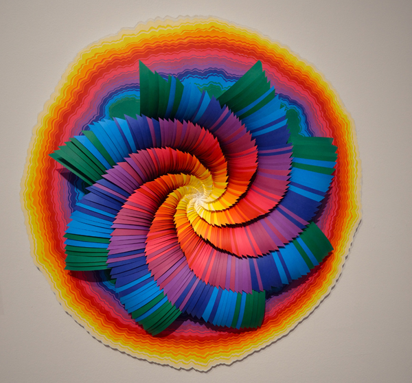
Take a look at this work by Jen Stark. This is a pinwheel-like object that has about ten colors in it. See what I did there? I identified how many colors there are (well I guesstimated, a little bullshit never hurt anybody right?) Identifying what you are looking at is key. I know it seems obvious, but it is a crucial step! I guess you could say that it was the colors of the rainbow but if you wanted to sound artsy and in-the- know, you should go into a little more detail than that. I would say, "I like how the colors gradiate from warm to cool. [It appears that I have made up this word, as I can't get the squiggly red line to disappear from underneath it. I'm sticking with it though. Now everyone repeat after me--> Gra-di-ate = to radiate outwards (or inwards) a gradient of color and/or value] The circular shape has a gradient from light to dark as well as from white to yellow to red to violet to blue. An easier way to describe this phenomenon would be to say it went from warm (yellow-orange-red) colors to cool (blue-green-violet) colors. 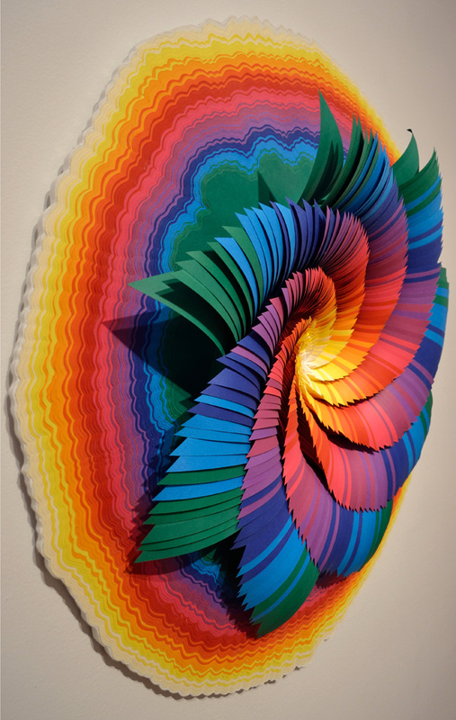
The pinwheel shape of the inner part of this piece has a color scheme opposite to that of the outer circle. It moves from cool colors on the outside to warm colors on the inside. Here is a bit of a trick question for you. Is the center of the pinwheel cool or warm? Well, for starters, what color is it? Or is it even a color at all? That last one was just to mess with your head. The center is white and for our purposes we won't debate whether white is a color or not. Warm and cool is RELATIVE! Thank you Doug Andersen for drilling that into my head! The white appears cool in this artwork because it is next to a warm yellow. By the way, the title of the piece is called Glow. It was made in 2014. I always look at the title of the artwork last. I guess it gives me the ability to see it in an unbiased fashion, sometimes artist's titles suck. (YES, even mine.)
Technology is pretty awesome. I finally bit the bullet and bought (charged) a new laptop. No longer will I sit down at Starbucks and be self-conscious of hipsteresque onlookers whispering to their buddies, "Hey, do you notice the guy with the vintage Dell, staring at the same Windows load screen for the past ten minutes. Hahahhahaa." No more frantically pounding CTRL+ALT+DELETE hoping to get my computer to restart after it freezes! Nope! Now I have 900 reasons to embrace the digital side of art with this shiny rectangle of plastic and metal, otherwise known as a laptop. Just as many others have looked down upon digital art, so too have I, but no longer. I am beginning to understand just how complicated and time-consuming it can be to produce a great work of art wholly on a computer screen. It takes a lot of time and a lot of knowledge (that of software programs and of general art principles of perspective, light, and value, etc) to make great works of digital art. Many artists are forced to use a drawing tablet that plugs in to the computer. You use a stylus (digitized pen) on the drawing tablet while looking at the screen to see where the cursor is. This is not how traditional art is done. The [Sony Vaio Flip 15a] laptop I bought gives me the ability to draw directly on the computer screen (which flips into an easel setup or lays completely flat like a tablet.) So, at any rate, I've been playing around with this ArtRage program it came with trying to teach myself more about digital art. 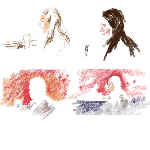
Above is an image of the four Layers I used to make this sketch. Layers are separate images that overlap each other. They mimic how a traditional artist paints on top of his pencil sketch, and then on top of the under-painting, and so on and so forth. One advantage with digital Layers is that you can make individual ones visible or hide them when you're done. You can reorder the Layers to change what overlaps what, too. As you can see here, I started with a pencil-like "brush" on a very textured canvas and then painted on another layer to cut out the profile of her face against the red background. Last, I painted more details in her face and added some shadows under the table just to differentiate that space from the gray of the girl's sweatshirt.. 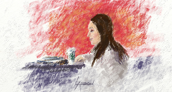
I think next time I won't use such a grainy, textured canvas to begin with. It made it hard to paint in the details of the face like the eyebrows and nostrils. I do like the textured look though, that's just my personal aesthetic, but I think less is more sometimes.
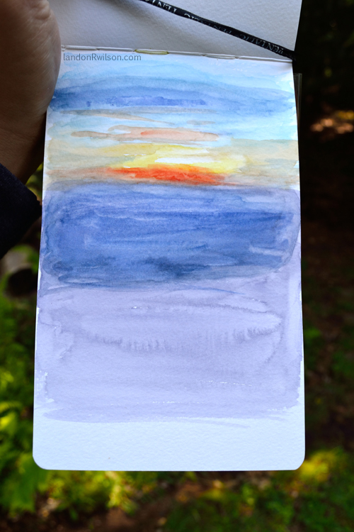
I was admiring the view out of the smallish window of an airplane when I had no choice but to do my best to capture that moment. It was awkward considering I had an aisle seat and was staring past a mother and her young daughter, but I'd never let awkward get in the way of a painting. The mother was worried that her daughter was in my way, but I told her not to worry, as I like a challenge sometimes. There's something about the way the sunset and clouds look when you can't see any land among them. It's very mesmerizing. The horizon looks as if it is going infinitely to the left and the right of the sun and there's nothing in the light's way to impede it. 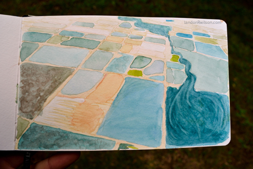
This is almost the opposite. There was no sky in view, only miles of farmland as far as the eye could see. I must admit on this one I snapped a picture on my cell phone and then did it later (on another flight, in the airport, who knows!) I've always loved the colorful grids that farmlands make when you see them from above.
I frequent the boardwalk in West Haven. Some parts are better than others; closer to the mouth of the river it is littered with 2 inch wide gaps (which make for a pretty uncomfortable bike ride) while other parts are beautifully paved and lined with seniors playing Bocce ball. Now that I think of it that might make for an interesting sketch, but on this day I found a gazebo... I thought it would be easy to find something to sketch at the beach but it took at least 15-20 minutes to find this area. I underestimated the importance of being, something hard to find at the beach. A few reasons why I chose this area was because it had a beachy feel (water in the background), architectural elements (I like drawing and painting buildings), and organic elements (the plants in the middleground add a nice textural opposition against the gazebo's straight lines). 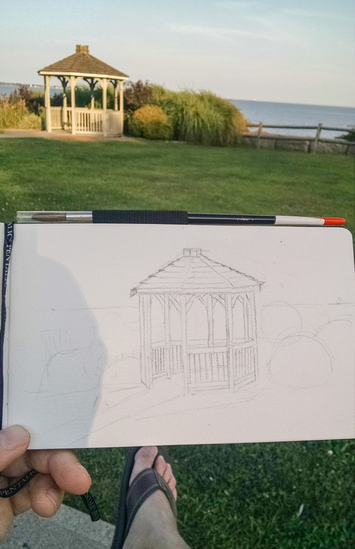
Here is my initial sketch done with a graphite pencil. Unlike the wood stove sketch I showed you a couple weeks ago, I took my time on the pencil sketch. It was probably a half-hour drawing and a half-hour painting. Take a mental note of the lighting. Right now almost the entire gazebo is covered in sunlight while the sky is mostly blue and gray. 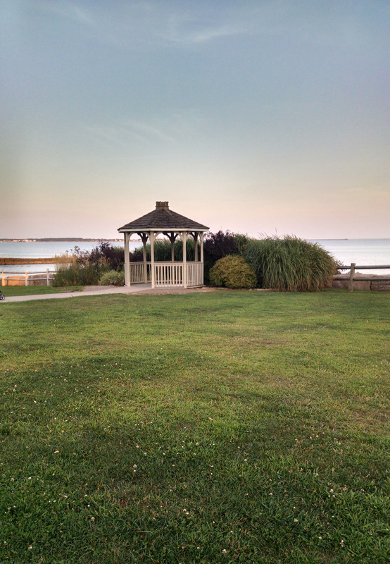
In this picture you can see the difference of the lighting in just an hour. Now the sunset has come into play and the sky in the background has changed from a light blue to a light red (or pink as many people have told me; I've always felt pink is rather brash and bold while light red is barely there, often going unnoticed.) YES.. I am anthropomorphizing colors. Get used to it. Also, the gazebo is no longer in sunlight. 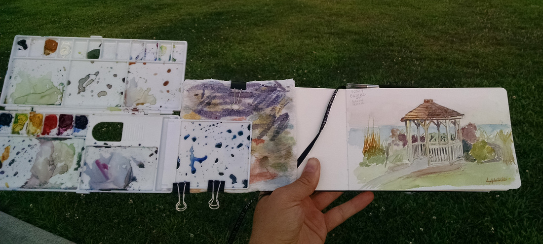
Here is the finished product along side my palette I clipped to my sketchbook. 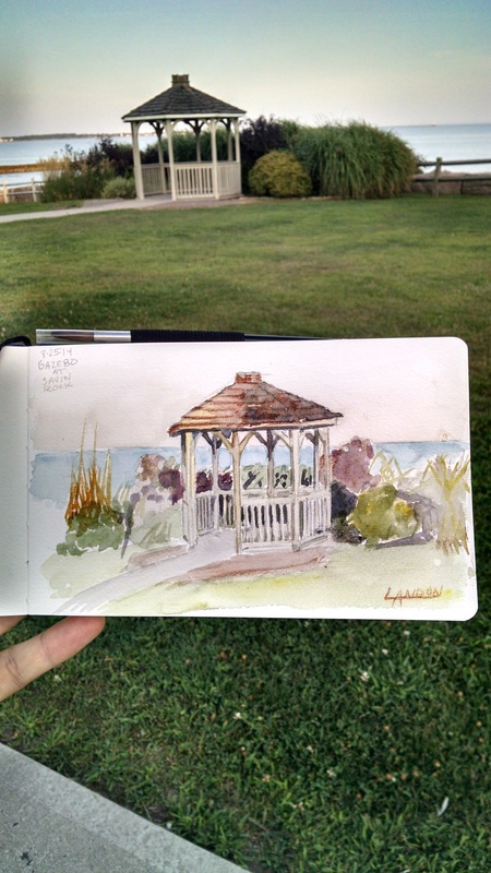
While that initial sketch took just an hour, an artist's work is never done! I decided to touch it up while waiting for my clothes to dry at the laundromat. One of the ladies working there paid me a compliment and then preceded to tell me I should take some classes... I'm not sure how I feel about that. Anyways, I added some darker values behind the gazebo and made the sky darker while adding some red near the horizon. 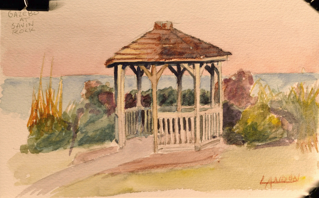
|
Landon R. WilsonWelcome to my blog. Archives
September 2019
|
 RSS Feed
