|
I rode my bike (bicycle - I really wish us cyclists could take back the word bike from motorcycles) to the Devil's Gear Bike Shop for a rack to put on my bike. I bought said rack and tried to install it outside of the shop as I did not have a rack on my bike to strap said rack to the bike so that I could ride without holding it in my hands. They conveniently have a bike stand and tools outside of the shop for anybody to use. I spotted a dumpster with a full load and decided that would be the best place to rest my kickstand-less bike. (I was too stubborn/anxious/embarrassed to try and figure out how the bike stand worked.) I'm sure the guy sitting next to the rack (on his lunch break from another store???) enjoyed watching me struggle with my bike trying to hold it up and install the rack at the same time. The dumpster had a nice lid for a shelf though. Naturally, the cafe employee needed to throw garbage into the dumpster while I was all setup so I had to move temporarily. Needless to say I installed the bike rack wrong, brought it inside, was told a much better way to do it, and then setup next to the bike stand... I think my thought process was if I am a little closer to it I can examine it on the down-low while no one is looking and possibly use it. I didn't. Another half hour later and I was finally on my way to the prison show!A another half hour later and I was finally on my way to the prison show! 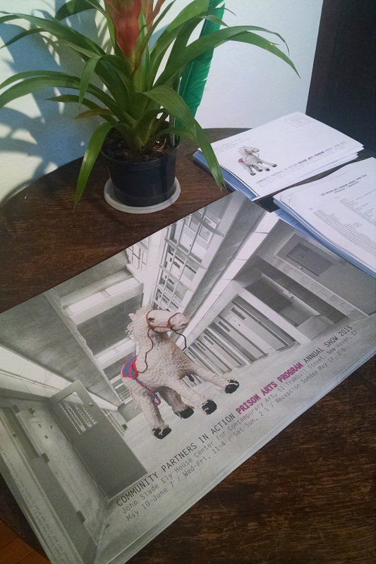 It was at the John Slade Ely House Center for Contemporary Art (that's a mouthful) on Trumbull St in New Haven. They have an exhibition from the Prison Arts Program. 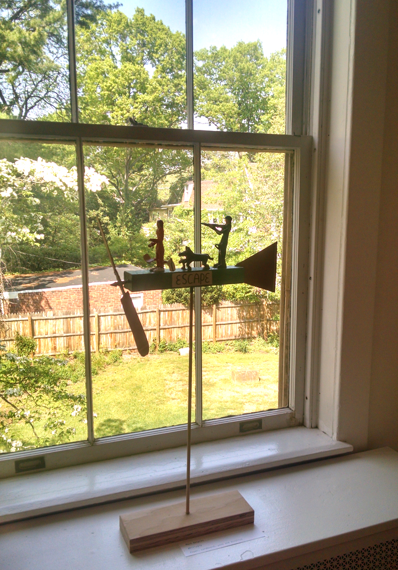 Mark Despres - Whirlygig I thought this was interesting probably because I have an obsession with airplanes. 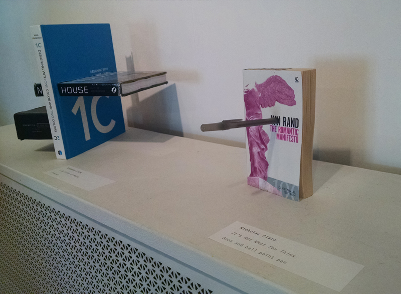 Works by Nicholas Clark. Here's a link to Ayn Rand's Wikipedia page in case like me, you had no idea who Ayn Rand was, other than knowing that she is always mentioned on Fox News. (One day I will read Atlas Shrugged, just not TOday. 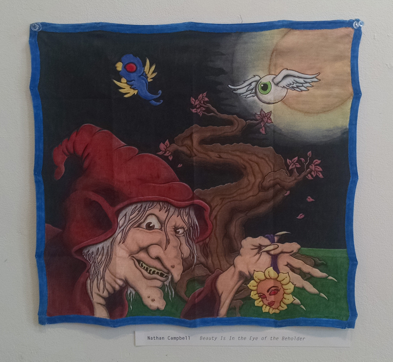 Nathan Campbell - Beauty Is In the Eye of the Beholder This was done on a cloth fabric, not sure how it was painted on? 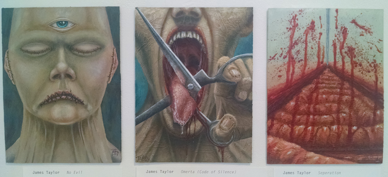 Works by James Taylor. Loved the texture of these! 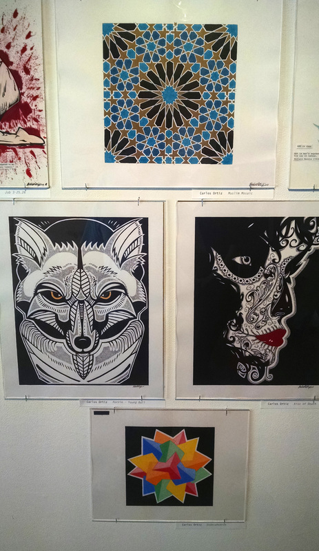 Carlos Ortiz. I like the graphic-ness of these. Beautiful line-work, too. 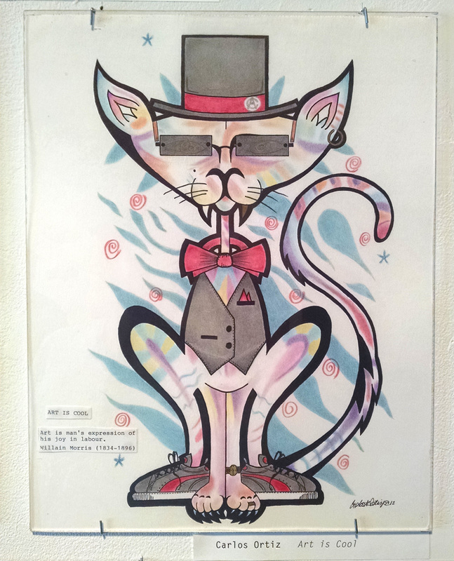 Carlos Ortiz - Art is Cool. No better way to finish up this post than with a pink panther. Art IS cool.
 Above is a development sketch. My nine-plus years of service in the valet industry have got me stuck on this idea for a space valet comic. This is me trying to flesh out some ideas. The central globe is an interstellar rest-stop. The ships enter the empty central area and are then parked out on the "flats" orbiting the rest stop. 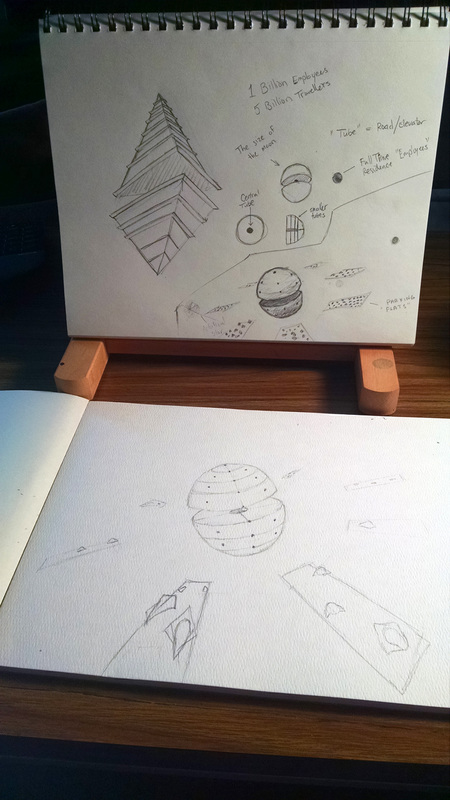 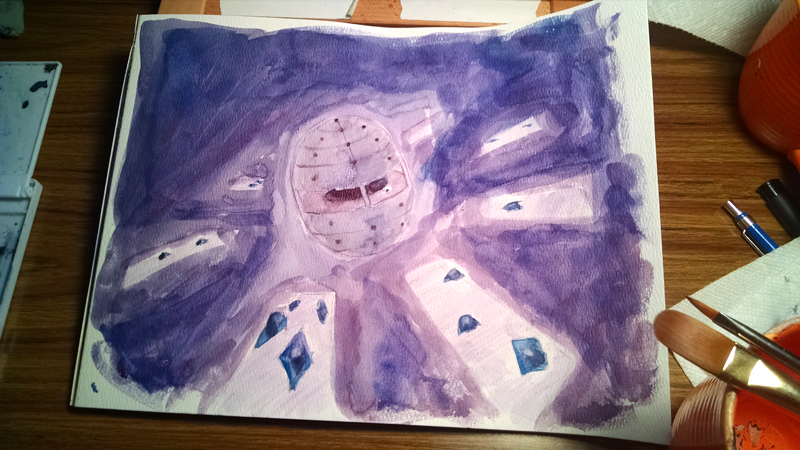 Despite not knowing really where to go with this idea, I got this undeniable urge to paint! What a wonderful feeling! This is watercolor on watercolor paper. 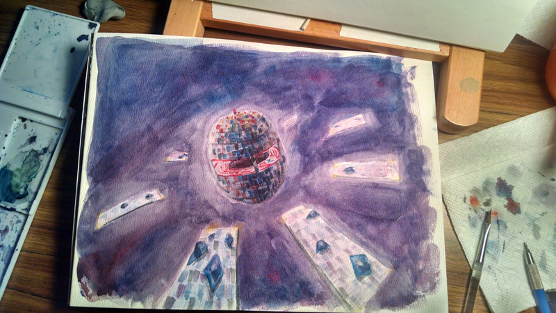 The rest-stop is brightly colored with lights and such. I feel like it would have a casino at the top and the employees live in the bottom. (Although there isn't really a top or bottom since it's a sphere... but I haven't figured that one out yet.) 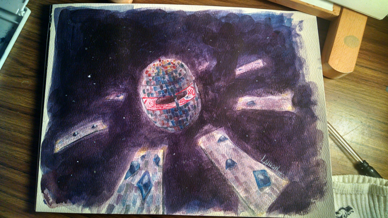 Finished sketch after I added some gouache, an opaque watercolor, to make some darks in the background.
If you have any questions or ideas, feel free to leave a comment or email me! Last month I went to the Yale Art Gallery. Last month was before this month. This month I haven't had a day off from my day job(s) PLUS I've had a logo project that had a very tight deadline. That's my excuse for not posting anything to the blog lately. I'm definitely looking forward to Sunday where I will probably vegetate on the couch. Now that, that's done. Here is some art! 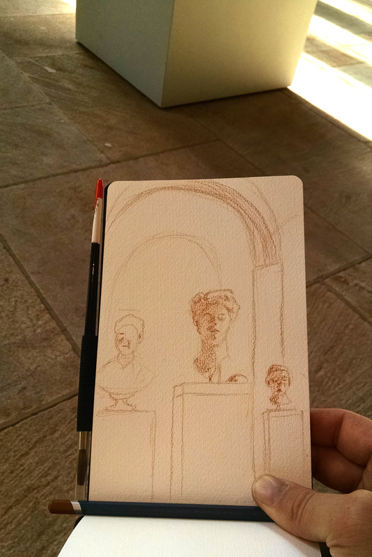 PENCILS ONLY!!! No water media is allowed in the galleries... I scoped out this beautiful scene with sunlight cutting across the room. Unfortunately, after I inspected all vantage points of the room and finally decided that the bench in the center offered the best place to sit and view, a young couple beat me to it by a couple of steps! Apparently they didn't know I was an artist and should be treated like a celebrity in museums. (It's so vain, lol, but it's kinda true.) I wish I could bring red velvet ropes around and cordon off areas so that I could have my own little VIP room and keep all the riffraff at a safe distance. So there went 15 minutes of precious drawing time I'll never get back. Naturally, at the end of the day I noticed literally one hundred artist stools conveniently located at the main entrance... 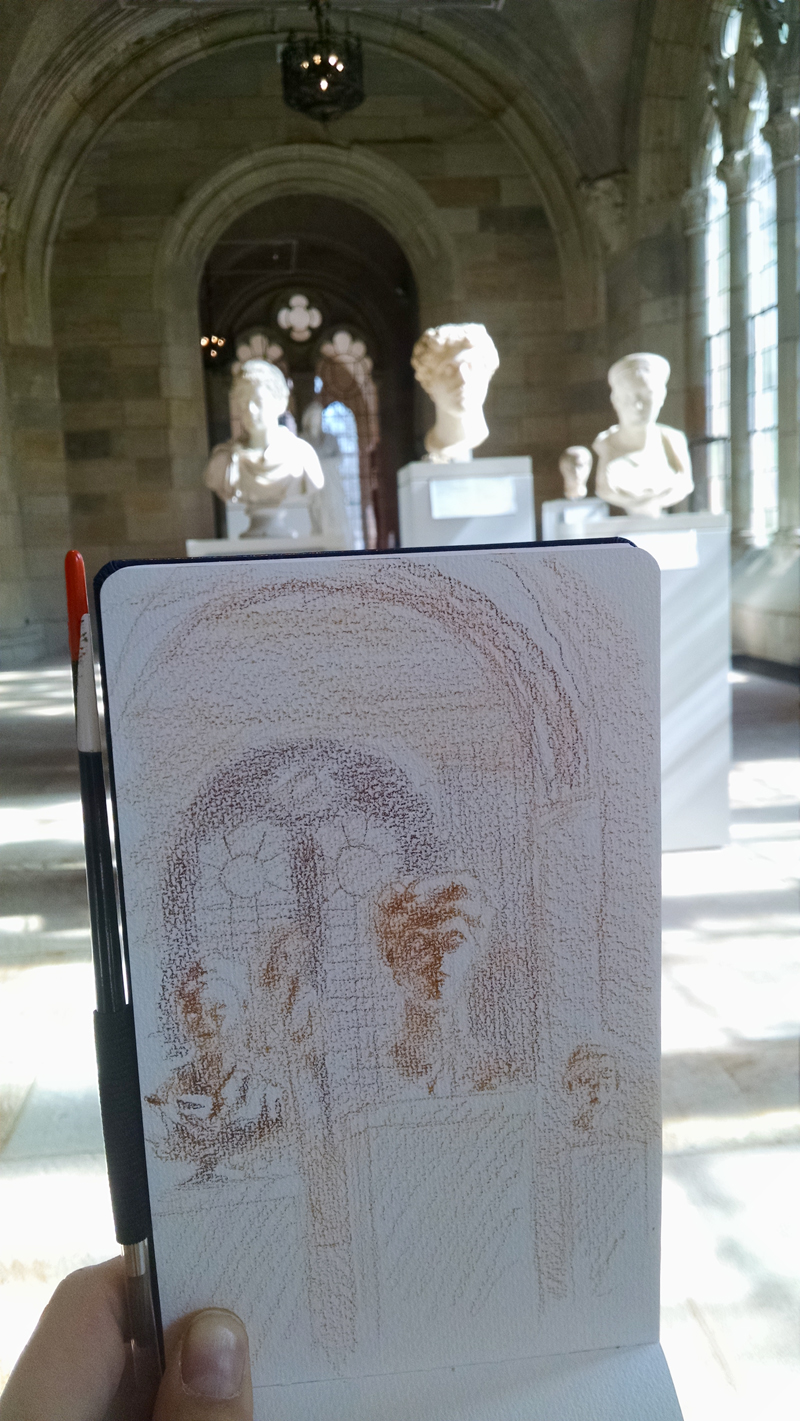 I'm using water-soluble pencils from Derwent. Check out the awesome sunlight action!  I made an escape to Jojo's for some much needed espresso. That gave me some time to wet the paper a bit with a water brush. 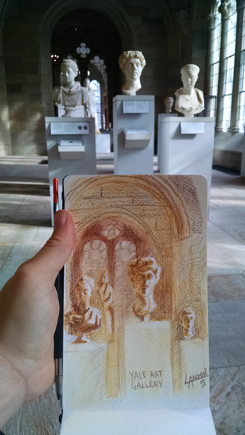 I added a couple more quarters to the parking meter and then hustled back over to the gallery for another go at it with the pencils. The light was a lot less dramatic after my little break... But it still helped me to solidify some of the shapes with a better value structure. 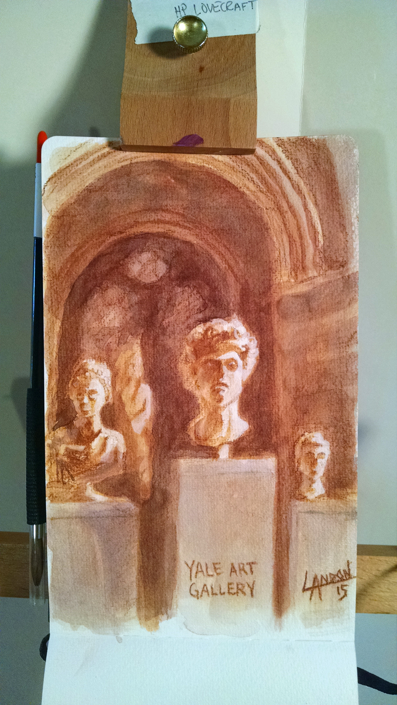 Here's the final image after I added more value to the background to get the busts in the foreground to stand out more.
If I were to do it again, I'd remember to bring a pencil! That way the original drawing is good as possible. (I would have liked more detail in the faces.) It's hard to paint over a poorly drawn image! Please indulge me and imagine Chris Farley saying the title of this blog post. If you don't know what I'm talking about, click here to see the Fat Guy in a Little Coat scene from the nineties movie Tommy Boy. 
With 15 minutes to kill at Starbucks, this guy's active and somewhat frantic demeanor while he was talking on the phone captivated me. I started with basic shapes also trying to get his overall posture correct. The slumped "wise-guy" kinda look was what I was after. I'm picturing Marlon Brando as Godfather. 
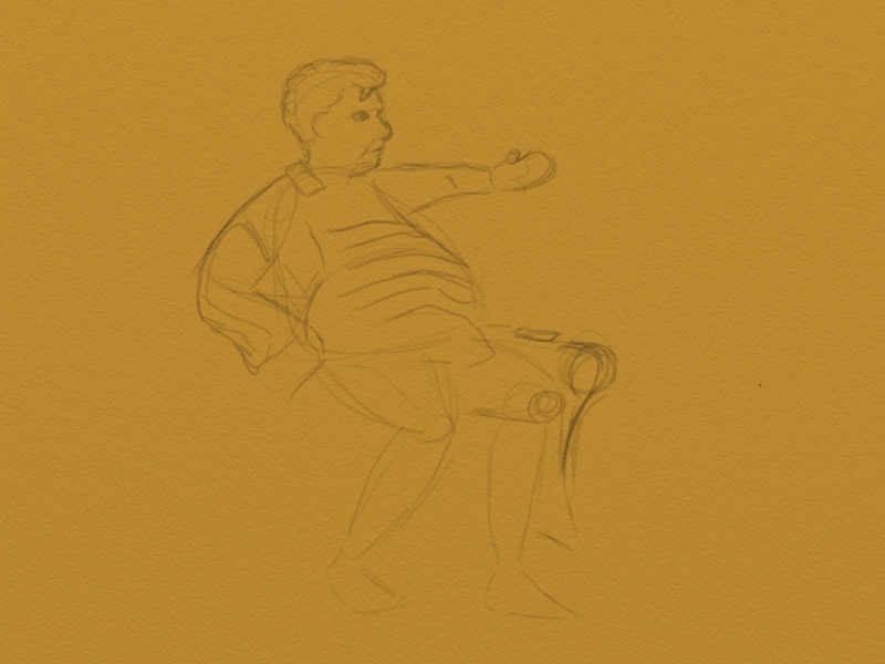
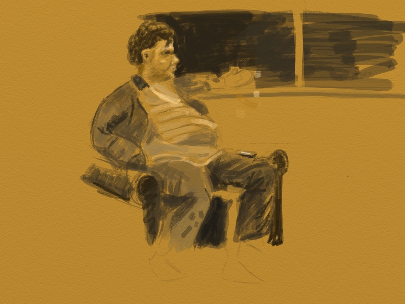
Julia was sitting across from me and he was directly behind her. Every time he glanced at me I pretended to be looking at Julia. It was a bit of a cat and mouse routine for me. I'm not sure that it was working but he seemed much more interested in who ever he was on the phone with anyways. 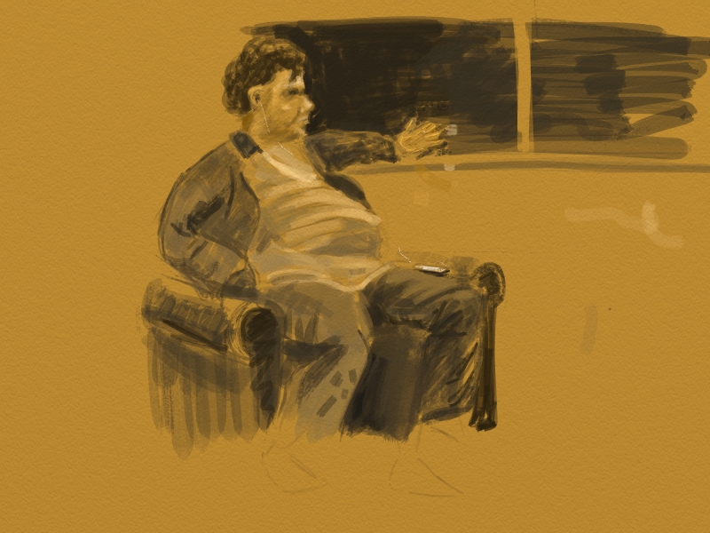
His left hand was only up near the window initially. I had to do it from memory and that is why it looks funny. Next time I'll spend more time on the face, too, and not bother with the fingers; just leave it as a hand shape. 15 minutes just isn't enough time for that kind of detail.
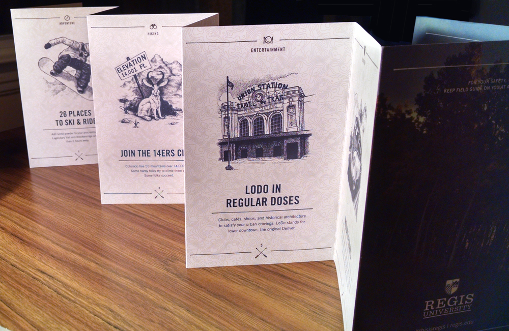
Check out this beautiful pamphlet made by Primacy, with help from my lovely girlfriend Julia. Check out her website at julialovemiller.com. Primacy is a creative marketing and technology company that works with universities (among many other clients) to boost their overall performance whether it be via website redesign, rebranding, marketing materials, etc. I really love the design of this "field guide" which is perfect to be handed out to prospective students to get a lay of the land at Regis University. 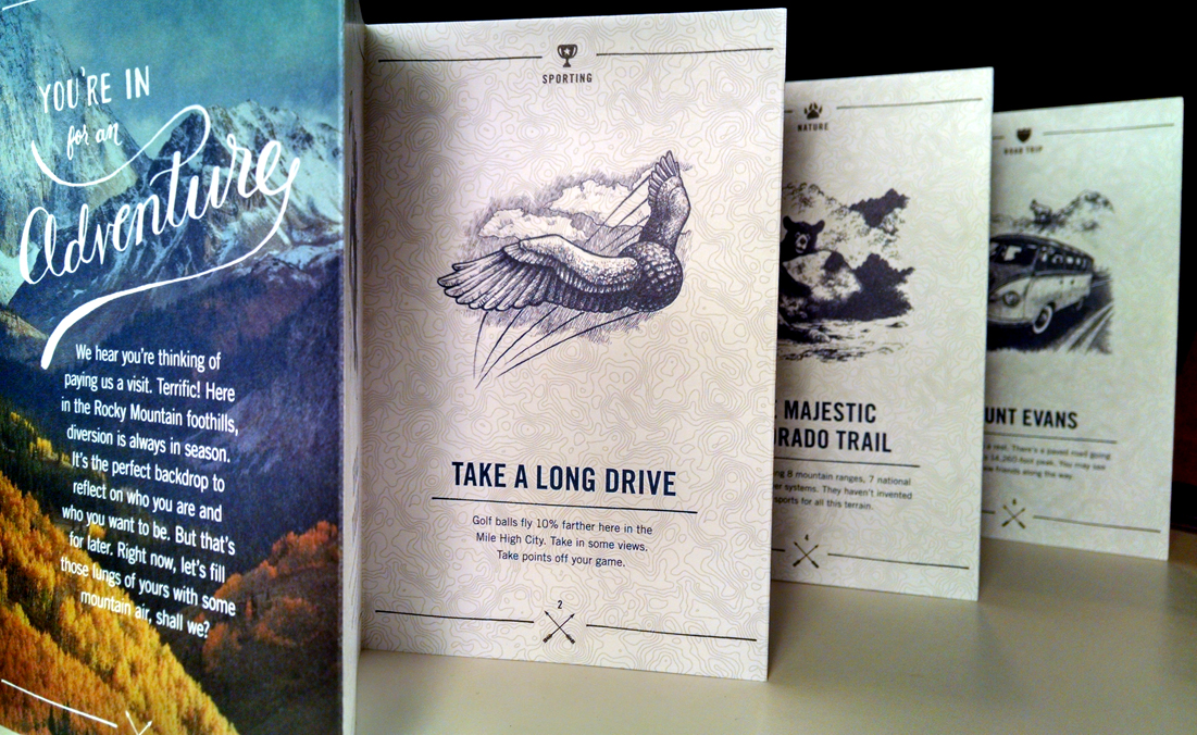
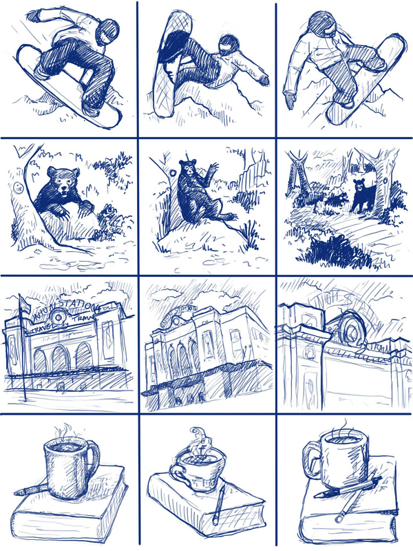
Here's some of the thumbnail sketches Julia did to help shape the final illustrations. 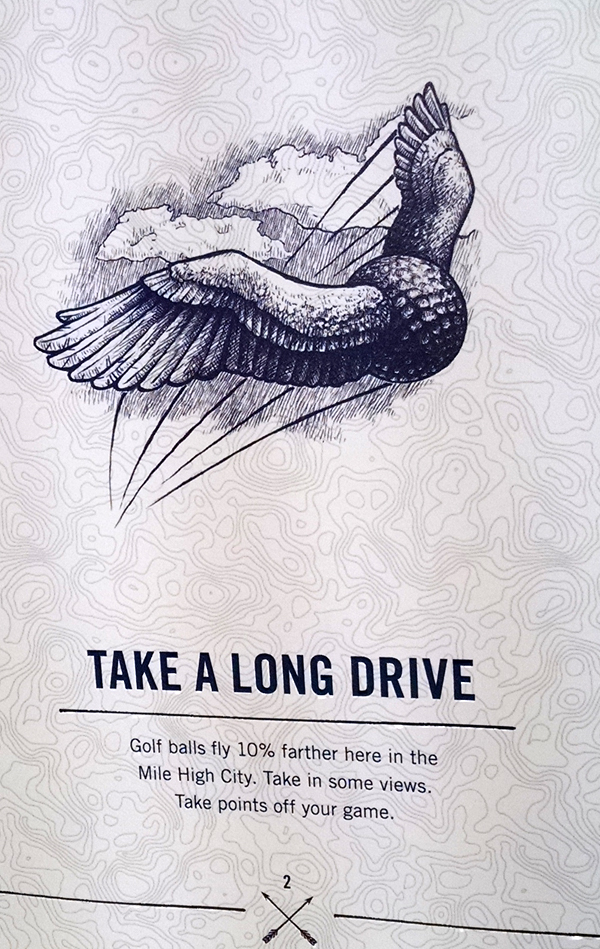

That's a Jack-a-lope up there. It was my understanding that it was a special request from the university. A Jack-a-lope is "an American mythological creature that is a mix between a jackrabbit and an antelope." 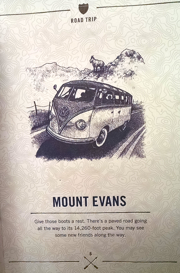
I like this VW bus a lot, too. We ended up going to Langan Volkswagen dealership in Glastonbury, CT. It is a pretty special place, with old VW's strewn throughout the showroom and [airbrushed] hoods with awesome artwork hanging on display. Just a ways up the road, in this unassuming building was a bona fide VW museum. It was so unassuming that it took us three times to drive by it before I got out of the car, peered through a dusty window and saw 20 tons of shiny (and rusty) metal behind it. 
Great illustration! Great design!
I paid upwards of $50 to hear a lecture. About science. At a casino. That is capitalism for ya! It truly is amazing to be in a crowd of a thousand geeks, nerds, children, teachers, and just general people excited about astronomy. If you've seen the Cosmos on Fox (it's streaming on Netflix now) then you may be familiar with who I saw. It would be one, Neil Degrasse Tyson. He is an Astrophysicist, Director of the Hayden Planetarium in New York City, and general celebrity scientist extraordinaire. The talk was somewhat repetitive if you've seen the Cosmos, however, he did broach the subject of earthquakes, considering our recent scare in Eastern CT. IT IS A SCARE, by the way. He showed us that in the same one week period, California had something like 2,000 earthquakes under the 3.3 magnitude; meanwhile, a year previous, there were [slightly] more earthquakes in that same week in California and the East Coast. It's nothing to shake a stick at. I was incredibly inspired by the talk. Neil is an incredibly charismatic and captivating public speaker. The best part was during the Q and A. There was a number of children who asked questions, or told [bad] jokes, as it were. I enjoyed the somewhat awkward, geeky guys and gals reading three paragraph questions off of their iPhones. Overall it was extremely inspiring. I have been cruising through any Astronomy media I can find on YouTube and Netflix since then. Here is one I have found particularly fascinating. The instructor Chris Impey has a way of adding in tidbits of information that really makes you want to know what he is going to say next. The first lecture is an awesome introduction to the basics of Astronomy, with many sidebars on the history of mankind and our many civilizations. I highly recommend it. I was inspired to do this planetary landscape. I imagine the surface to be completely encompassed by this red liquid that has worn down the rocks over thousands of years, but they are still slightly porous-looking. Maybe there is a bacteria in the water that is surviving in the gas-filled atmosphere. (I was thinking Helium but I haven't researched to see the IF's, HOW's and WHY's of that.) 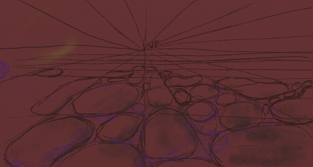 I added texture to the rocks and most of this gaseous atmosphere. I stayed with the same hue (maroon.) 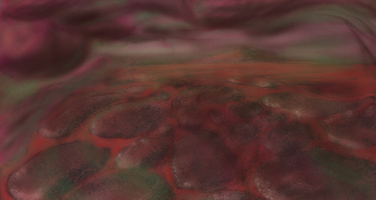 Here's your basic perspective sketch. VP stands for Vanishing Point, all roads lead there. I started with a maroon background instead of white. That is unusual for me but I think that helped this image a lot. 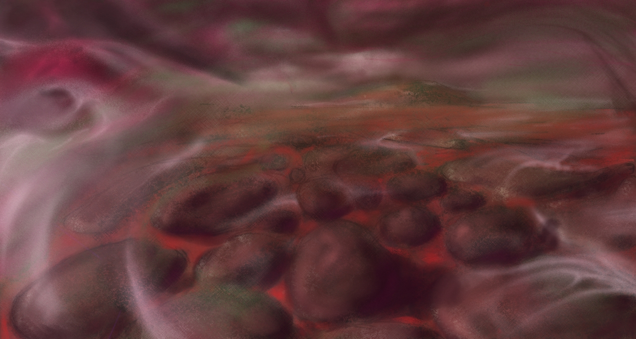 The clouds were not very good originally, so I took a picture while at work of some stormy clouds and used that as reference. I also added some mist being swept across the liquid-filled lands. 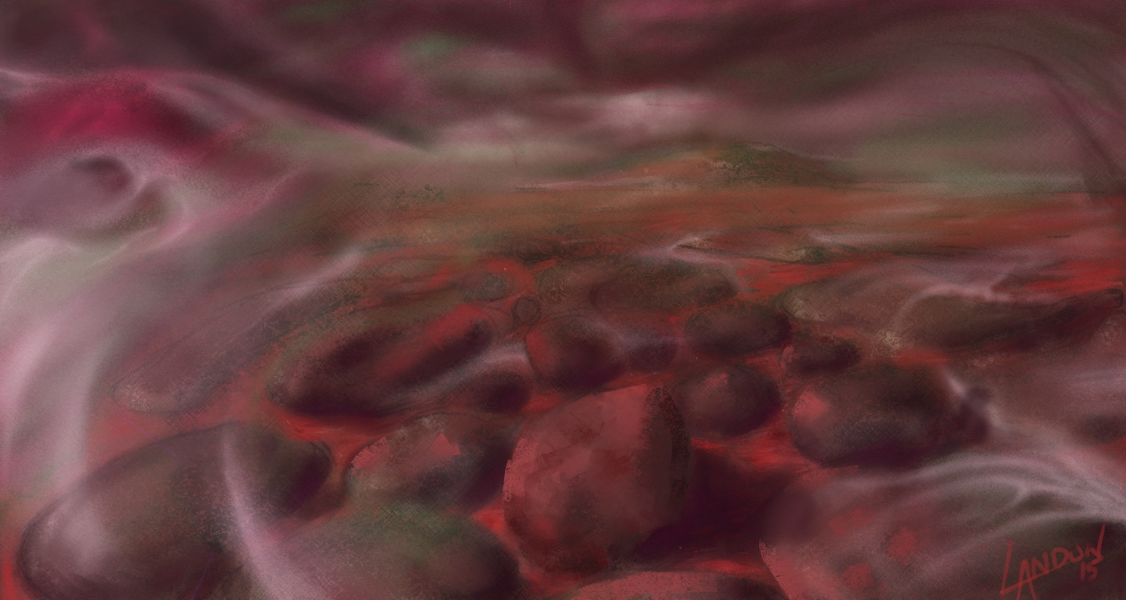 Here I added some highlights on the rocks. I also tried to make them more 3-dimensional; however, I didn't draw them like that originally and I wish I had now!  I could work on this for longer but sometimes you have to call it quits and this is just a sketch after all. I added some more pencil texture and highlights to the rocks and the liquid. Overall, I really like the idea of this planet and could see it fully-realized sometime down the road.
 Sorry for the long delay! I'd said I'd take one week off and of course it turned into three and a half weeks of total sloth-dom. I was afraid of that but at least I now know that I will eventually get back to the keyboard! I have been busy, but that's more of an excuse than anything. I have a submarine commission I'm doing as well as a logo project; and my own personal projects, too. I've also got a couple of new goodies in my studio that I'll talk about on another post, too. Here's a drawing I did for an artist friend of mine Mark Williams to hold you over. He is one of my former instructors; he really encouraged me to continue with my art aspirations after a drawing class I took at Three Rivers Community College. I had never realized that art was a way to make a living, it just never dawned on me. He was the first person to ask me, "So what are you planning on doing [with your talent]?" That's when I realized I could make money by drawing/painting. I guess it was also because I could say I know someone who is making money through art, so if they can do it, surely I can to!
That's how I look at the world, generally. Monkey see. Monkey do. I found this not-so-well edited 90s(?) news clip while researching how to spell monkey see, monkey do. DON'T JUDGE ME!!! I thought do had two o's... visually it made sense to me. The opening sequence with the boys talking about [Mortal Kombat, the video game] had me hysterical for awhile.) Anyways, thank you, Mark! This only took me a year to finish, by the way. Yeeeeeaaaaah, I know, a whole year. That's what happens when [this] artist doesn't enforce a deadline on a project. It is "cave inspired." It is also pencil on paper and about 6 by 9 inches. Sometimes I like to see what I can create when I am constrained by only using a line -=====[xx> That's a sword if you can't tell already! I've never been much for these crazy emoticons and such, so don't critique me too much! Anyways, I've been having trouble transferring to digital because a lot of my creativity comes from the absence of being able to do something, somehow. I.E. not being able to do color so I use pattern to create life when I draw in graphite. But digitally I have the ability to recreate oil, watercolor, whatever and sometimes I try all three or more types in one single painting and it does not turn out well! I guess I have to figure out someway, some trick, to keep me only using one type of brush or one color... Well I'll end on that [open-ended] note. It's Christmas time again. A most wonderful time of the year. Cherished memories come flooding back to me as I'm bombarded by red bow after red bow. Gilded pine combs are in abundance; it's amazing what a bit of shiny paint will do to a decomposing piece of wood. It all makes me warm and fuzzy inside with hopes and dreams of creating new memories. It's mostly the niece and nephew that bring me happiness on Christmas morning now. Despite the rapid-fire opening of presents and nonchalant thanks that leave a lot to be desired, I still enjoy the quality family time. It reminds me of playing the lottery, really. Every year there's that one gift that makes their eyes gloss over and captivates their attention for the rest of the day. The only question remains... will it be mine this year? One can only hope. Well here is my last design for Christmas cards this year. I look forward to continuing this tradition and am excited for what I will do next year! 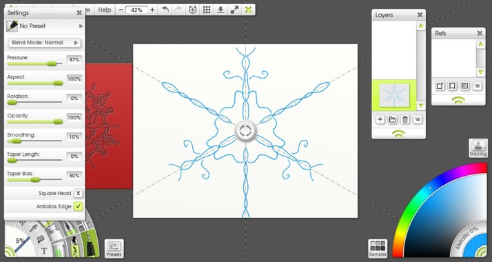 I started off with the Paint Symmetry tool in ArtRage 4 (for the Desktop). I researched the fact that snow flakes are six-limbed. I changed how many axis' their are in the Paint Symmetry tool so that it mirrored my brush strokes six times over. Once I was satisfied with my design I made a Stencil with it. This allowed me to replicate the basic pattern over and over again easily and also scale it to any size I wanted. 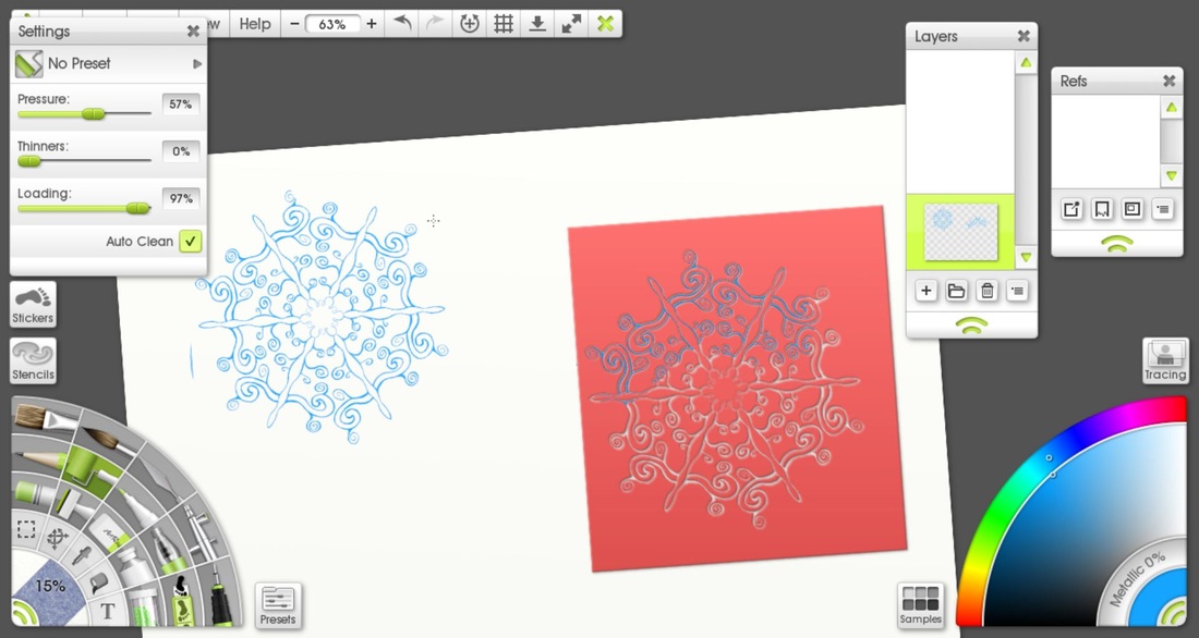 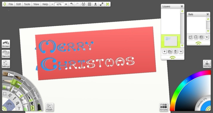 The lettering I did from scratch. It took a long time, like a really long time.. so long I don't want to admit it publicly. Unfortunately I don't have any process shots of that but basically I started drawing in pencil on one layer. I had to lay out two rulers and space each letter individually. Then on a layer on top I inked my design while continually tweaking the letters. Once I was happy with that I made a stencil so that I could move the type around anywhere I wanted to. Originally I planned to do this all in ArtRage, and I used the Oil Tube brush and splattered on thick gobs of paint and then pushed it around with a large Oil brush to create that nice gradient from dark to light. You can really see the texture of the brush strokes here. 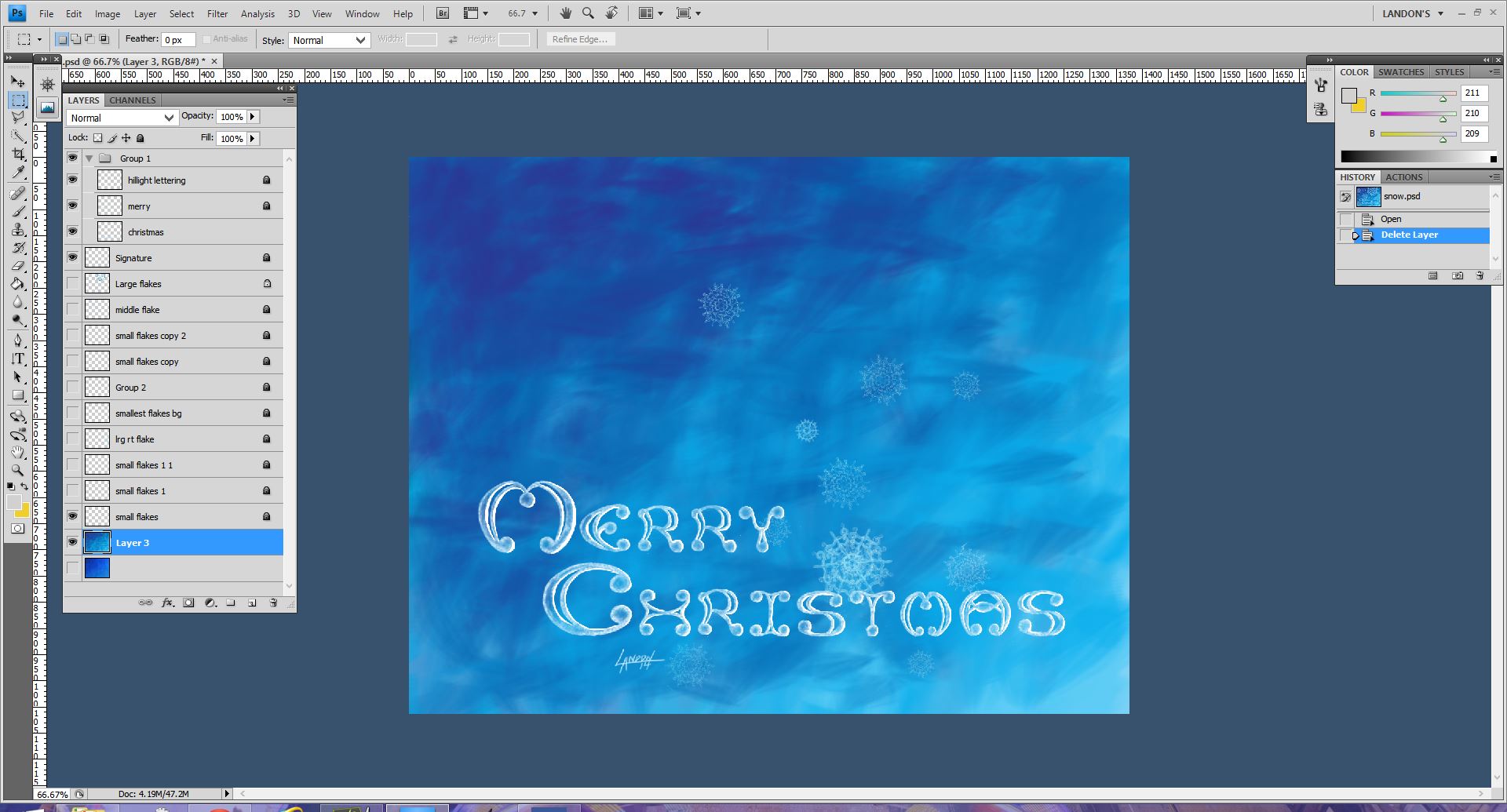 When I printed a test out it was barely noticeable that I had a gradient. You also couldn't see the texture in the brushstrokes. I decided to re-do the gradient in Photoshop. You can see the difference easily, there is no more natural looking texture and it is a different blue (It is Cyan so that the printer can replicate it properly.) I printed this and it looked pretty good. 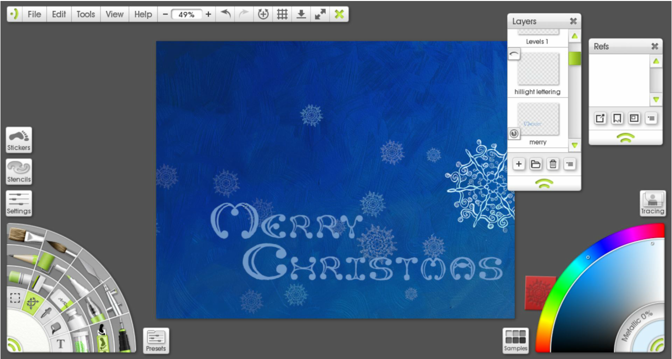 From there I just kept adding more snowflakes by copying and pasting, varying their sizes, opacity, and location until I was satisfied with the composition. For the snowflakes in the foreground I painted on top of the original stencil to change them so that there were little differences in each of them. Below is the final PRINT version. Compare the difference to the final Digital version which is below that.   I may take next week off so Happy Holidays to you and your family :) May you feel loved and blessed as I do.
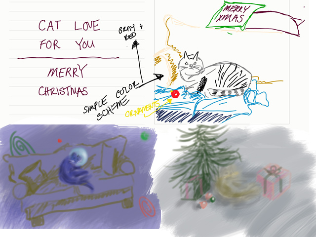 On top is the original idea I had. I was cat-sitting for my girlfriend's parents and I was inspired to draw "Mittens" from life. I grew quite fond of her the three weeks she was with us and I'm not ashamed to say it anymore! The bottom right was another quick sketch done in Photoshop. I quickly realized I wanted to do away with the more common Christmas themes; in the bottom left I cemented the space idea. The thumbnail contained a couch which I was told by Julia that it made no sense in space so I got rid of it,too. One of my mantra's is, "If it's too simple, simplify it more!" But sometimes it takes someone else to remind me of that! (I still think a cat on a couch floating in space is a funny image.) Once I cemented the cat lost in space idea, I googled "cat in space" to see what else was out there. Well, believe it or not, there's apparently hundreds of thousands of cats flying out in space at this very moment... Most of them are really bad Photoshops though. I wanted to have a very lonely cat and considered having Earth in the background to portray this. I also wanted to portray the fact that the cat was lit by the sun it was inching ever so closely towards. I decided to eliminate a [large] Earth in another effort to simplify. 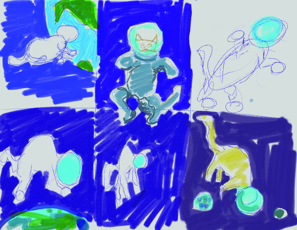  I tried doing most of this painting in Photoshop originally. Printing the other two cards made me realize I should try and keep the colors in the CMYK range rather than web colors RGB. You can't do that in ArtRage. (For those who don't know, when printing artwork, etc.. the printer usually only has 4 colors to choose from. When you buy a cartridge from Staples for your computer you are buying the colors Cyan, Magenta, Yellow, and Black. There is a limited set of colors that you can mix from this, I find that blues are especially difficult to match. RGB contains basically all the colors we can see. As an artist and illustrator, there is always a battle to reproduce artwork on paper as it is on canvas, or monitor, or whatever.) Anyways, I still find Photoshop confusing and un-intuitive so I decided to do it over in ArtRage for a more controlled but painterly feel. 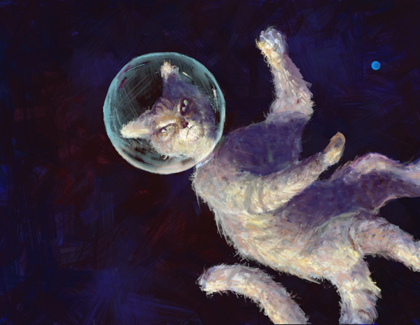 I liked the warmth of the orange cat in the image before this one but thought it stood out too much. This is space and there is not a lot of light out there, which means there is not a lot of color, too. I liked how the ArtRage program gave me the control to produce a kind of ratty looking cat. You can see I still had a small earth in the right corner. I printed this and saw that it was too dark, of course. 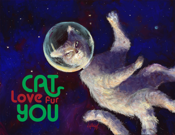 I added some brighter blue to the background and some bright stars to really get the spacescape going. I did the type in Adobe Illustrator and spent a good amount of time playing around with the way the "A" in cat mimicked a cat's tail. There was a point where it looked more like a snake than a cat's tail! Originally, it was planned to be Cat love FOR you" but at the very last minute the "fur" pun came to me. I definitely feel that this is a successful image and I am completely happy with it! (I can't say that about a lot of things I've done)
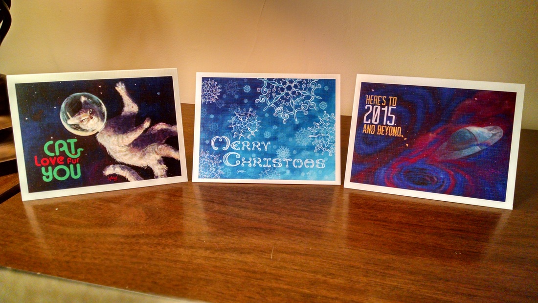 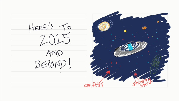 I finally finished my first series of illustrated holiday cards. Each image was digitally painted by yours truly. Some of the typography was also made from scratch by me (the Merry Christmas lettering was done by hand). The cards were printed on linen card stock with a color front and black and white back. The inside is free for you to inscribe whatever your heart's desire. Each week I will go through a card step-by-step so you can see how it was made. If you are interested on purchasing the cards I will ship them to you. I will provide a direct link to my online store at the end of the post. In this first image, I was simply fleshing out multiple ideas. I enjoy making the loose swirly ellipses you see in different colors. They make appearances in many of my sketches and final artworks. I briefly thought of making the stars confetti, but decided that would be too much. 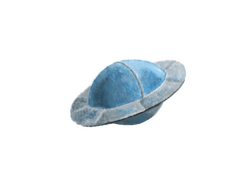 Instead of using the Chalk brush, I decided to use the Oil brush. I love oil painting and the ability to mix colors on the canvas; ArtRage does a great job of replicating that feeling. 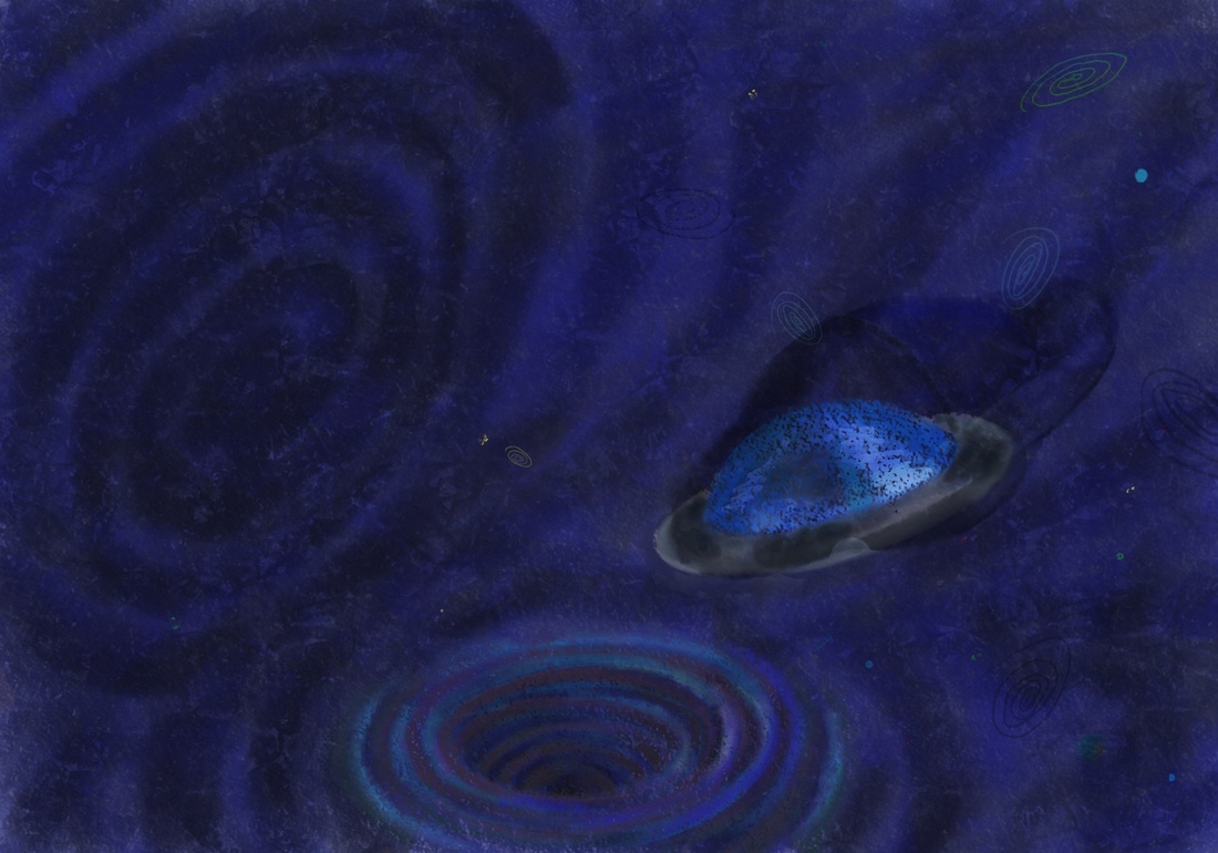 I turned the swirly ellipse into a blackhole-like whirlpool at the bottom of the composition. I mimicked the whirlpool idea above and to the left, too. I just saw Interstellar in the IMAX theater. It was awesome. An experience rather than just a movie. There is something about the mystery surrounding black holes that really intrigues me, and everyone else I'm sure. Imagine if we knew everything about everything. What a crappy life that would be! I think the visual depiction of the black holes in Interstellar were truly awe-inspiring and deeply inventive. Onward and upward.. you can see that I am still testing out textures in the ArtRage program I am using. This was the first design I did and I had a lot to learn about my favorite new painting software program. The spaceship especially has some funky things going on with it texture-wise. The shape and size were off and I decided to do it as a separate painting then bring it into the spacescape. 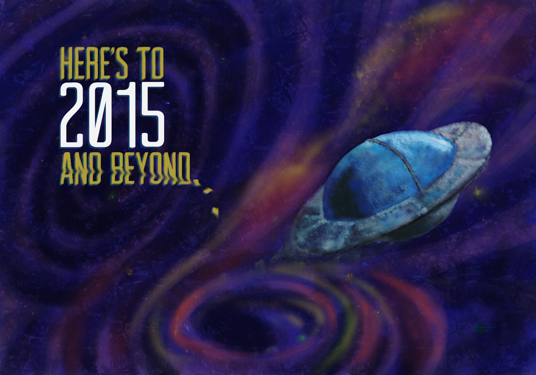 I printed the above image and realized that it was WAY too dark of an image to print properly. When you paint on a canvas that has a screen lit up behind it, it's hard to remember that when the ink sits on paper it will not have a 100-watt light bulb behind it. The colors are lost to darkness, too. I decided to repaint the entire image in brighter, lighter colors. Oh, I also turned my screen brightness down to less than halfway! 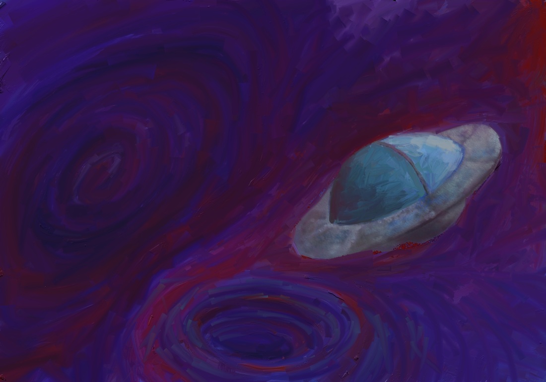 I globbed on piles of oil paint using the Paint Tube brush and then switched to a very large Oil brush to start smearing the paint together. 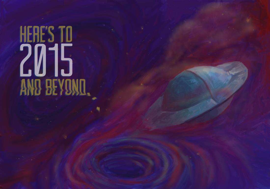 I went to the print shop to have some mock-ups made with the final image above. It printed dark. AGAIN! (My teeth are clenched and I'm shaking my head back and forth as I write this.) It's kinda painful when you spend so many hours on something and then have to continually tweak it just so that it prints halfway-decently! 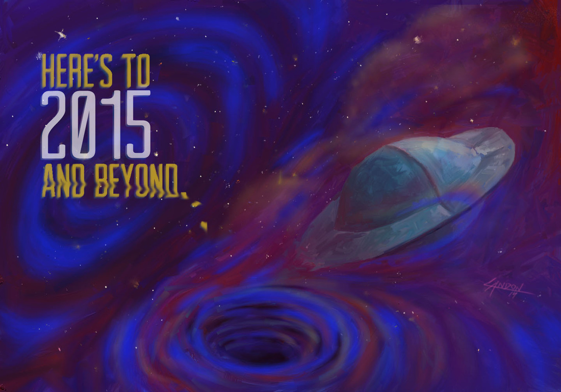 Here's the final image. I ended up taking it into Photoshop and airbrushing in some bright blues over the darkest parts of the spacescape. The printed version still looks slightly different than this, a little less whispy and the stars are a bit dimmer... But overall I am really happy with how it turned out!
|
Landon R. WilsonWelcome to my blog. Archives
September 2019
|
 RSS Feed
